Skip to main content
Statistics for Business
My Course
Learn
Exam Prep
AI Tutor
Study Guides
Flashcards
Explore
Try the app
My Course
Learn
Exam Prep
AI Tutor
Study Guides
Flashcards
Explore
Try the app
Back
Visualizing Qualitative vs. Quantitative Data definitions
You can tap to flip the card.
Qualitative Data
You can tap to flip the card.
👆
Qualitative Data
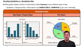
Observations represented by names or labels, such as eye color or nationality, without numerical values.
Track progress
Control buttons has been changed to "navigation" mode.
1/14
Related flashcards
Related practice
Recommended videos
Visualizing Qualitative vs. Quantitative Data quiz #1
Visualizing Qualitative vs. Quantitative Data
10 Terms
Visualizing Qualitative vs. Quantitative Data
2. Describing Data with Tables and Graphs
10 problems
Topic
Ernest
Frequency Distributions
2. Describing Data with Tables and Graphs
10 problems
Topic
Justin
2. Describing Data with Tables and Graphs
10 topics
15 problems
Chapter
David-Paige
Guided course
04:39
Visualizing Qualitative vs. Quantitative Data
829
views
61
rank
Terms in this set (14)
Hide definitions
Qualitative Data
Observations represented by names or labels, such as eye color or nationality, without numerical values.
Quantitative Data
Observations represented by numerical values, such as test scores or heights, allowing for mathematical analysis.
Bar Chart
A visual displaying frequencies of categories with separate vertical bars, where bar height indicates frequency.
Pie Chart
A circular graphic dividing data into wedges, each showing the percentage or proportion of a category within a whole.
Frequency
The count of how often a particular observation or value appears within a dataset.
Pareto Chart
A specialized bar chart with bars arranged in descending order to highlight the most significant categories.
Histogram
A bar graph for numerical data where adjacent bars touch, representing frequencies of continuous numerical intervals.
Frequency Polygon
A line graph connecting points representing frequencies of numerical intervals, offering a continuous view of data distribution.
Stem Plot
A display splitting numbers into left and right digits, revealing both frequency and actual data values in a compact form.
Category
A distinct group or label used to classify qualitative data, such as eye color or nationality.
Proportion
A value expressing the part of a whole that a category or group represents, often shown as a percentage.
Class Interval
A range of numerical values grouped together on the x-axis of histograms and frequency polygons.
Distribution
The overall pattern of how data values are spread or clustered within a dataset.
Observation
An individual data point or measurement collected within a dataset, either qualitative or quantitative.
 BackBack


 04:39
04:39