use the frequency polygon to identify the class with the greatest, and the class with the least, frequency.
Table of contents
- 1. Intro to Stats and Collecting Data1h 14m
- 2. Describing Data with Tables and Graphs1h 55m
- 3. Describing Data Numerically2h 5m
- 4. Probability2h 16m
- 5. Binomial Distribution & Discrete Random Variables3h 6m
- 6. Normal Distribution and Continuous Random Variables2h 11m
- 7. Sampling Distributions & Confidence Intervals: Mean3h 23m
- Sampling Distribution of the Sample Mean and Central Limit Theorem19m
- Distribution of Sample Mean - Excel23m
- Introduction to Confidence Intervals15m
- Confidence Intervals for Population Mean1h 18m
- Determining the Minimum Sample Size Required12m
- Finding Probabilities and T Critical Values - Excel28m
- Confidence Intervals for Population Means - Excel25m
- 8. Sampling Distributions & Confidence Intervals: Proportion1h 25m
- 9. Hypothesis Testing for One Sample3h 57m
- 10. Hypothesis Testing for Two Samples4h 50m
- Two Proportions1h 13m
- Two Proportions Hypothesis Test - Excel28m
- Two Means - Unknown, Unequal Variance1h 3m
- Two Means - Unknown Variances Hypothesis Test - Excel12m
- Two Means - Unknown, Equal Variance15m
- Two Means - Unknown, Equal Variances Hypothesis Test - Excel9m
- Two Means - Known Variance12m
- Two Means - Sigma Known Hypothesis Test - Excel21m
- Two Means - Matched Pairs (Dependent Samples)42m
- Matched Pairs Hypothesis Test - Excel12m
- 11. Correlation1h 24m
- 12. Regression1h 50m
- 13. Chi-Square Tests & Goodness of Fit2h 21m
- 14. ANOVA1h 57m
2. Describing Data with Tables and Graphs
Frequency Polygons
Problem 2.RE.5
Textbook Question
In Exercises 5 and 6, use the data set, which represents the number of rooms reserved during one night’s business at a sample of hotels.
153 104 118 166 89 104 100 79 93 96 116
94 140 84 81 96 108 111 87 126 101 111
122 108 126 93 108 87 103 95 129 93 124
Construct a frequency distribution for the data set with six classes and draw a frequency polygon.
Verified step by step guidance1
Step 1: Determine the range of the data set. To do this, subtract the smallest value from the largest value in the data set. The smallest value is 79, and the largest value is 166. Compute the range as: Range = 166 - 79.
Step 2: Calculate the class width. Divide the range by the number of classes (6 in this case) and round up to the nearest whole number. Use the formula: Class Width = ⌈Range / Number of Classes⌉.
Step 3: Create the class intervals. Start with the smallest value (79) as the lower limit of the first class. Add the class width to determine the upper limit of the first class. Repeat this process to create six consecutive, non-overlapping classes.
Step 4: Tally the data into the classes to construct the frequency distribution. Count how many data points fall into each class interval and record the frequencies.
Step 5: Draw a frequency polygon. Plot the midpoints of each class interval on the x-axis and the corresponding frequencies on the y-axis. Connect the points with straight lines to form the polygon. Ensure to include points at the beginning and end of the graph to close the polygon.
Verified video answer for a similar problem:This video solution was recommended by our tutors as helpful for the problem above
Video duration:
8mPlay a video:
Was this helpful?
Key Concepts
Here are the essential concepts you must grasp in order to answer the question correctly.
Frequency Distribution
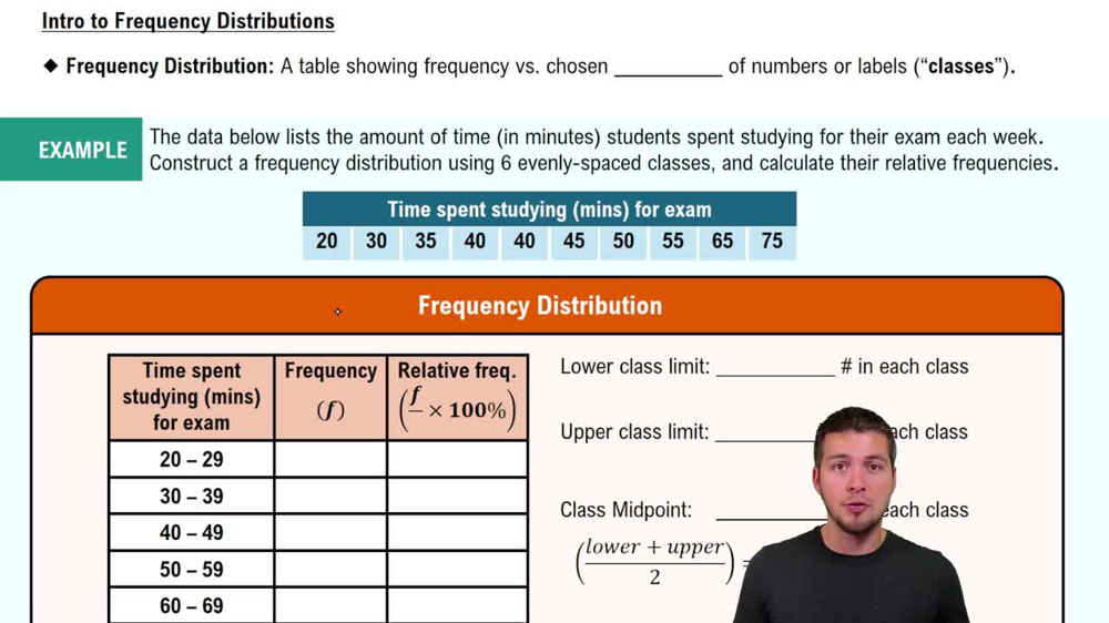
A frequency distribution is a summary of how often each value occurs in a dataset. It organizes data into classes or intervals, showing the number of observations (frequency) that fall within each class. This helps in understanding the distribution of data points and identifying patterns or trends.
Recommended video:
Guided course
Intro to Frequency Distributions
Classes and Class Width
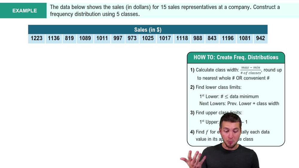
Classes are the intervals into which data is grouped in a frequency distribution. The class width is the range of values that each class covers, calculated by subtracting the lower limit of a class from its upper limit. Choosing an appropriate number of classes and class width is crucial for accurately representing the data.
Recommended video:
Guided course
How to Create Frequency Distributions Example 2
Frequency Polygon
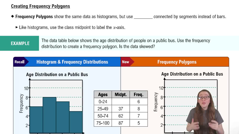
A frequency polygon is a graphical representation of a frequency distribution. It is created by plotting the midpoints of each class against their corresponding frequencies and connecting these points with straight lines. This visual tool helps to easily identify trends and the overall shape of the data distribution.
Recommended video:
Creating Frequency Polygons
Watch next
Master Creating Frequency Polygons with a bite sized video explanation from Patrick
Start learningRelated Videos
Related Practice
Textbook Question