What type of variable is required when drawing a time-series plot? Why do we draw time-series plots?
Table of contents
- 1. Intro to Stats and Collecting Data1h 14m
- 2. Describing Data with Tables and Graphs1h 56m
- 3. Describing Data Numerically2h 5m
- 4. Probability2h 16m
- 5. Binomial Distribution & Discrete Random Variables3h 6m
- 6. Normal Distribution and Continuous Random Variables2h 11m
- 7. Sampling Distributions & Confidence Intervals: Mean3h 23m
- Sampling Distribution of the Sample Mean and Central Limit Theorem19m
- Distribution of Sample Mean - Excel23m
- Introduction to Confidence Intervals15m
- Confidence Intervals for Population Mean1h 18m
- Determining the Minimum Sample Size Required12m
- Finding Probabilities and T Critical Values - Excel28m
- Confidence Intervals for Population Means - Excel25m
- 8. Sampling Distributions & Confidence Intervals: Proportion2h 10m
- 9. Hypothesis Testing for One Sample5h 8m
- Steps in Hypothesis Testing1h 6m
- Performing Hypothesis Tests: Means1h 4m
- Hypothesis Testing: Means - Excel42m
- Performing Hypothesis Tests: Proportions37m
- Hypothesis Testing: Proportions - Excel27m
- Performing Hypothesis Tests: Variance12m
- Critical Values and Rejection Regions28m
- Link Between Confidence Intervals and Hypothesis Testing12m
- Type I & Type II Errors16m
- 10. Hypothesis Testing for Two Samples5h 37m
- Two Proportions1h 13m
- Two Proportions Hypothesis Test - Excel28m
- Two Means - Unknown, Unequal Variance1h 3m
- Two Means - Unknown Variances Hypothesis Test - Excel12m
- Two Means - Unknown, Equal Variance15m
- Two Means - Unknown, Equal Variances Hypothesis Test - Excel9m
- Two Means - Known Variance12m
- Two Means - Sigma Known Hypothesis Test - Excel21m
- Two Means - Matched Pairs (Dependent Samples)42m
- Matched Pairs Hypothesis Test - Excel12m
- Two Variances and F Distribution29m
- Two Variances - Graphing Calculator16m
- 11. Correlation1h 24m
- 12. Regression3h 33m
- Linear Regression & Least Squares Method26m
- Residuals12m
- Coefficient of Determination12m
- Regression Line Equation and Coefficient of Determination - Excel8m
- Finding Residuals and Creating Residual Plots - Excel11m
- Inferences for Slope31m
- Enabling Data Analysis Toolpak1m
- Regression Readout of the Data Analysis Toolpak - Excel21m
- Prediction Intervals13m
- Prediction Intervals - Excel19m
- Multiple Regression - Excel29m
- Quadratic Regression15m
- Quadratic Regression - Excel10m
- 13. Chi-Square Tests & Goodness of Fit2h 21m
- 14. ANOVA2h 28m
2. Describing Data with Tables and Graphs
Time-Series Graph
Problem 2.2.18d
Textbook Question
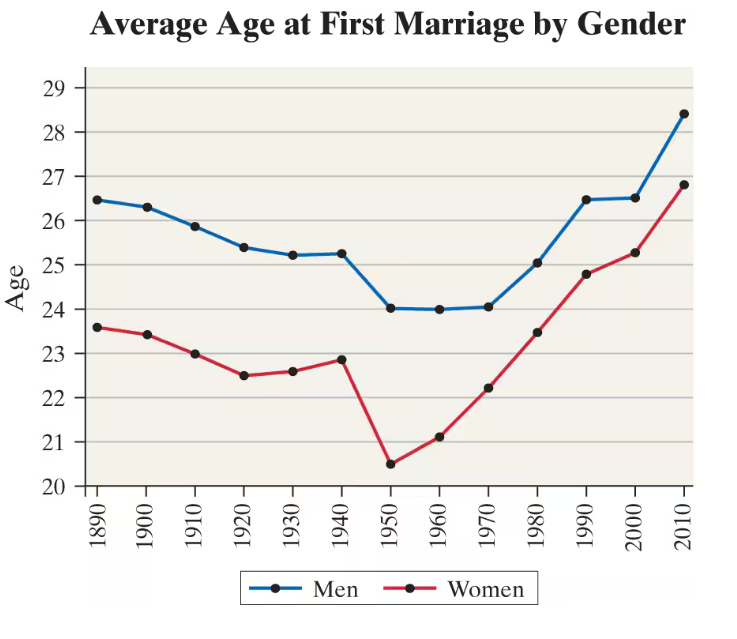
"Age at First Marriage The following time-series plot shows the average age at which individuals first marry by gender for each year of the census since 1890.

d. In which year was the difference in the average age of men and women at which they first married the least?"
Verified step by step guidance1
Identify the two lines on the graph: the blue line represents the average age at first marriage for men, and the red line represents the average age at first marriage for women.
For each year shown on the x-axis, note the corresponding average ages for men and women from the y-axis values.
Calculate the difference in average age between men and women for each year by subtracting the women's average age from the men's average age: \(\text{Difference} = \text{Age}_{men} - \text{Age}_{women}\).
Compare these differences across all years to find the smallest difference value.
Identify the year corresponding to this smallest difference, which is the year when the average ages at first marriage for men and women were closest.
Verified video answer for a similar problem:This video solution was recommended by our tutors as helpful for the problem above
Video duration:
2mPlay a video:
0 Comments
Key Concepts
Here are the essential concepts you must grasp in order to answer the question correctly.
Time-Series Data
Time-series data consists of observations collected sequentially over time. In this question, the average age at first marriage is recorded for men and women across different census years, allowing us to analyze trends and changes over time.
Recommended video:
Creating Time-Series Graphs
Difference Between Two Data Series
To find the year with the least difference in average age at first marriage between men and women, we calculate the absolute difference between the two series for each year. The smallest difference indicates the year when the ages were closest.
Recommended video:
Guided course
Probabilities Between Two Values
Graph Interpretation
Interpreting line graphs involves reading data points accurately and comparing trends. Here, understanding how to read the plotted points for men and women and visually or numerically comparing their values is essential to answer the question.
Recommended video:
Creating Time-Series Graphs
Watch next
Master Creating Time-Series Graphs with a bite sized video explanation from Patrick
Start learningRelated Videos
Related Practice
Textbook Question
58
views
