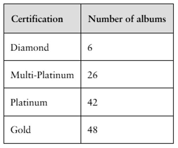
Using the table below, which category would appear first in a Pareto Chart representing the data?
Table of contents
- 1. Intro to Stats and Collecting Data1h 14m
- 2. Describing Data with Tables and Graphs1h 56m
- 3. Describing Data Numerically2h 5m
- 4. Probability2h 17m
- 5. Binomial Distribution & Discrete Random Variables3h 6m
- 6. Normal Distribution and Continuous Random Variables2h 11m
- 7. Sampling Distributions & Confidence Intervals: Mean3h 23m
- Sampling Distribution of the Sample Mean and Central Limit Theorem19m
- Distribution of Sample Mean - ExcelBonus23m
- Introduction to Confidence Intervals15m
- Confidence Intervals for Population Mean1h 18m
- Determining the Minimum Sample Size Required12m
- Finding Probabilities and T Critical Values - ExcelBonus28m
- Confidence Intervals for Population Means - ExcelBonus25m
- 8. Sampling Distributions & Confidence Intervals: Proportion2h 10m
- 9. Hypothesis Testing for One Sample5h 8m
- Steps in Hypothesis Testing1h 6m
- Performing Hypothesis Tests: Means1h 4m
- Hypothesis Testing: Means - ExcelBonus42m
- Performing Hypothesis Tests: Proportions37m
- Hypothesis Testing: Proportions - ExcelBonus27m
- Performing Hypothesis Tests: Variance12m
- Critical Values and Rejection Regions28m
- Link Between Confidence Intervals and Hypothesis Testing12m
- Type I & Type II Errors16m
- 10. Hypothesis Testing for Two Samples5h 37m
- Two Proportions1h 13m
- Two Proportions Hypothesis Test - ExcelBonus28m
- Two Means - Unknown, Unequal Variance1h 3m
- Two Means - Unknown Variances Hypothesis Test - ExcelBonus12m
- Two Means - Unknown, Equal Variance15m
- Two Means - Unknown, Equal Variances Hypothesis Test - ExcelBonus9m
- Two Means - Known Variance12m
- Two Means - Sigma Known Hypothesis Test - ExcelBonus21m
- Two Means - Matched Pairs (Dependent Samples)42m
- Matched Pairs Hypothesis Test - ExcelBonus12m
- Two Variances and F Distribution29m
- Two Variances - Graphing CalculatorBonus16m
- 11. Correlation1h 24m
- 12. Regression3h 33m
- Linear Regression & Least Squares Method26m
- Residuals12m
- Coefficient of Determination12m
- Regression Line Equation and Coefficient of Determination - ExcelBonus8m
- Finding Residuals and Creating Residual Plots - ExcelBonus11m
- Inferences for Slope31m
- Enabling Data Analysis ToolpakBonus1m
- Regression Readout of the Data Analysis Toolpak - ExcelBonus21m
- Prediction Intervals13m
- Prediction Intervals - ExcelBonus19m
- Multiple Regression - ExcelBonus29m
- Quadratic Regression15m
- Quadratic Regression - ExcelBonus10m
- 13. Chi-Square Tests & Goodness of Fit2h 21m
- 14. ANOVA2h 29m
2. Describing Data with Tables and Graphs
Bar Graphs and Pareto Charts
Problem 2.T.5b
Textbook Question
The table lists the number of albums by The Beatles that received sales certifications. Display the data using (b) a Pareto chart. (Source: Recording Industry Association of America)

 Verified step by step guidance
1
Step 1: Understand the concept of a Pareto chart. A Pareto chart is a type of bar graph where the bars are arranged in descending order of frequency or importance. It often includes a cumulative percentage line to show the proportion of the total represented by the bars.
Step 2: Organize the data in descending order based on the number of albums. From the table, the order will be: Gold (48), Platinum (42), Multi-Platinum (26), Diamond (6).
Step 3: Calculate the cumulative frequency for each category. Start with the highest frequency (Gold) and add the frequencies sequentially: Gold (48), Gold + Platinum (48 + 42 = 90), Gold + Platinum + Multi-Platinum (90 + 26 = 116), and finally Gold + Platinum + Multi-Platinum + Diamond (116 + 6 = 122).
Step 4: Compute the cumulative percentage for each category. Divide each cumulative frequency by the total number of albums (122) and multiply by 100 to get the percentage. For example, Gold cumulative percentage = (48 / 122) * 100.
Step 5: Create the Pareto chart. Plot the bars for each category in descending order of frequency (Gold, Platinum, Multi-Platinum, Diamond). Overlay a cumulative percentage line on the chart, starting at the first bar and increasing as you move to the next category.
 Verified video answer for a similar problem:
This video solution was recommended by our tutors as helpful for the problem above
Video duration:
5mPlay a video:
0 Comments
Key Concepts
Here are the essential concepts you must grasp in order to answer the question correctly.
Pareto Chart
A Pareto chart is a type of bar graph that represents the frequency or impact of problems in a process, arranged in descending order. It is based on the Pareto principle, which states that roughly 80% of effects come from 20% of causes. In this context, the chart will visually display the number of albums by The Beatles that received different sales certifications, highlighting the most significant categories.
Recommended video:

Creating Bar Graphs and Pareto Charts
Sales Certifications
Sales certifications are awards given to music albums based on the number of copies sold. Common certifications include Gold, Platinum, Multi-Platinum, and Diamond, each representing different sales thresholds. Understanding these certifications is crucial for interpreting the data, as they indicate the commercial success of The Beatles' albums.
Recommended video:

Creating Time-Series Graphs
Data Visualization
Data visualization is the graphical representation of information and data. By using visual elements like charts and graphs, complex data sets can be made more accessible and understandable. In this case, creating a Pareto chart will help to quickly convey the distribution of album certifications, allowing for easier comparison and analysis of The Beatles' sales performance.
Recommended video:
Guided course

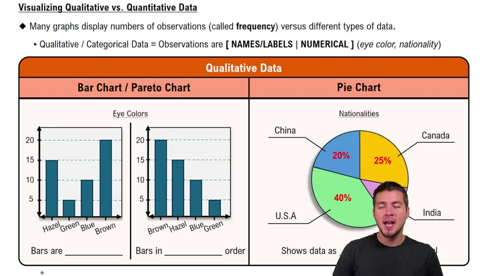
Visualizing Qualitative vs. Quantitative Data
Related Videos
Related Practice
Multiple Choice
390
views
6
rank
1
comments


