True or False: If the linear correlation coefficient is close to 0, then the two variables have no relation.
Table of contents
- 1. Intro to Stats and Collecting Data1h 14m
- 2. Describing Data with Tables and Graphs1h 56m
- 3. Describing Data Numerically2h 5m
- 4. Probability2h 17m
- 5. Binomial Distribution & Discrete Random Variables3h 6m
- 6. Normal Distribution and Continuous Random Variables2h 11m
- 7. Sampling Distributions & Confidence Intervals: Mean3h 23m
- Sampling Distribution of the Sample Mean and Central Limit Theorem19m
- Distribution of Sample Mean - ExcelBonus23m
- Introduction to Confidence Intervals15m
- Confidence Intervals for Population Mean1h 18m
- Determining the Minimum Sample Size Required12m
- Finding Probabilities and T Critical Values - ExcelBonus28m
- Confidence Intervals for Population Means - ExcelBonus25m
- 8. Sampling Distributions & Confidence Intervals: Proportion2h 10m
- 9. Hypothesis Testing for One Sample5h 8m
- Steps in Hypothesis Testing1h 6m
- Performing Hypothesis Tests: Means1h 4m
- Hypothesis Testing: Means - ExcelBonus42m
- Performing Hypothesis Tests: Proportions37m
- Hypothesis Testing: Proportions - ExcelBonus27m
- Performing Hypothesis Tests: Variance12m
- Critical Values and Rejection Regions28m
- Link Between Confidence Intervals and Hypothesis Testing12m
- Type I & Type II Errors16m
- 10. Hypothesis Testing for Two Samples5h 37m
- Two Proportions1h 13m
- Two Proportions Hypothesis Test - ExcelBonus28m
- Two Means - Unknown, Unequal Variance1h 3m
- Two Means - Unknown Variances Hypothesis Test - ExcelBonus12m
- Two Means - Unknown, Equal Variance15m
- Two Means - Unknown, Equal Variances Hypothesis Test - ExcelBonus9m
- Two Means - Known Variance12m
- Two Means - Sigma Known Hypothesis Test - ExcelBonus21m
- Two Means - Matched Pairs (Dependent Samples)42m
- Matched Pairs Hypothesis Test - ExcelBonus12m
- Two Variances and F Distribution29m
- Two Variances - Graphing CalculatorBonus16m
- 11. Correlation1h 24m
- 12. Regression3h 33m
- Linear Regression & Least Squares Method26m
- Residuals12m
- Coefficient of Determination12m
- Regression Line Equation and Coefficient of Determination - ExcelBonus8m
- Finding Residuals and Creating Residual Plots - ExcelBonus11m
- Inferences for Slope31m
- Enabling Data Analysis ToolpakBonus1m
- Regression Readout of the Data Analysis Toolpak - ExcelBonus21m
- Prediction Intervals13m
- Prediction Intervals - ExcelBonus19m
- Multiple Regression - ExcelBonus29m
- Quadratic Regression15m
- Quadratic Regression - ExcelBonus10m
- 13. Chi-Square Tests & Goodness of Fit2h 21m
- 14. ANOVA2h 29m
1. Intro to Stats and Collecting Data
Intro to Stats
Problem 4.1.18a
Textbook Question
In Problems 17–20, (a) draw a scatter diagram of the data,

Verified step by step guidance1
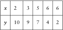
Step 1: Identify the paired data points from the table. The pairs are (2, 10), (3, 9), (5, 7), (6, 4), and (6, 2).
Step 2: Set up a coordinate system with the x-axis representing the variable x and the y-axis representing the variable y. Choose an appropriate scale to accommodate all x values (2 to 6) and y values (2 to 10).
Step 3: For each pair (x, y), plot a point on the scatter diagram by locating the x-value on the horizontal axis and the corresponding y-value on the vertical axis.
Step 4: Mark each point clearly on the graph. For example, plot a point at x=2 and y=10, another at x=3 and y=9, and so on for all pairs.
Step 5: After plotting all points, observe the overall pattern or trend in the scatter diagram, which can help in understanding the relationship between x and y.
Verified video answer for a similar problem:This video solution was recommended by our tutors as helpful for the problem above
Video duration:
1mPlay a video:
0 Comments
Key Concepts
Here are the essential concepts you must grasp in order to answer the question correctly.
Scatter Diagram
A scatter diagram is a graphical representation of paired data points plotted on a coordinate plane. It helps visualize the relationship or correlation between two variables by showing how one variable changes with respect to the other.
Recommended video:
Probability of Mutually Exclusive Events
Correlation
Correlation measures the strength and direction of a linear relationship between two variables. It can be positive, negative, or zero, indicating whether variables increase together, one increases as the other decreases, or no linear relationship exists.
Recommended video:
Guided course
Correlation Coefficient
Paired Data
Paired data consists of two related sets of observations, where each x-value corresponds to a y-value. Understanding paired data is essential for plotting scatter diagrams and analyzing relationships between variables.
Recommended video:
Introduction to Collecting Data
Related Videos
Related Practice
Textbook Question
68
views
