Which of the following is a feature of a dot plot?
Table of contents
- 1. Intro to Stats and Collecting Data1h 14m
- 2. Describing Data with Tables and Graphs1h 56m
- 3. Describing Data Numerically2h 5m
- 4. Probability2h 17m
- 5. Binomial Distribution & Discrete Random Variables3h 6m
- 6. Normal Distribution and Continuous Random Variables2h 11m
- 7. Sampling Distributions & Confidence Intervals: Mean3h 23m
- Sampling Distribution of the Sample Mean and Central Limit Theorem19m
- Distribution of Sample Mean - ExcelBonus23m
- Introduction to Confidence Intervals15m
- Confidence Intervals for Population Mean1h 18m
- Determining the Minimum Sample Size Required12m
- Finding Probabilities and T Critical Values - ExcelBonus28m
- Confidence Intervals for Population Means - ExcelBonus25m
- 8. Sampling Distributions & Confidence Intervals: Proportion2h 10m
- 9. Hypothesis Testing for One Sample5h 8m
- Steps in Hypothesis Testing1h 6m
- Performing Hypothesis Tests: Means1h 4m
- Hypothesis Testing: Means - ExcelBonus42m
- Performing Hypothesis Tests: Proportions37m
- Hypothesis Testing: Proportions - ExcelBonus27m
- Performing Hypothesis Tests: Variance12m
- Critical Values and Rejection Regions28m
- Link Between Confidence Intervals and Hypothesis Testing12m
- Type I & Type II Errors16m
- 10. Hypothesis Testing for Two Samples5h 37m
- Two Proportions1h 13m
- Two Proportions Hypothesis Test - ExcelBonus28m
- Two Means - Unknown, Unequal Variance1h 3m
- Two Means - Unknown Variances Hypothesis Test - ExcelBonus12m
- Two Means - Unknown, Equal Variance15m
- Two Means - Unknown, Equal Variances Hypothesis Test - ExcelBonus9m
- Two Means - Known Variance12m
- Two Means - Sigma Known Hypothesis Test - ExcelBonus21m
- Two Means - Matched Pairs (Dependent Samples)42m
- Matched Pairs Hypothesis Test - ExcelBonus12m
- Two Variances and F Distribution29m
- Two Variances - Graphing CalculatorBonus16m
- 11. Correlation1h 24m
- 12. Regression3h 33m
- Linear Regression & Least Squares Method26m
- Residuals12m
- Coefficient of Determination12m
- Regression Line Equation and Coefficient of Determination - ExcelBonus8m
- Finding Residuals and Creating Residual Plots - ExcelBonus11m
- Inferences for Slope31m
- Enabling Data Analysis ToolpakBonus1m
- Regression Readout of the Data Analysis Toolpak - ExcelBonus21m
- Prediction Intervals13m
- Prediction Intervals - ExcelBonus19m
- Multiple Regression - ExcelBonus29m
- Quadratic Regression15m
- Quadratic Regression - ExcelBonus10m
- 13. Chi-Square Tests & Goodness of Fit2h 21m
- 14. ANOVA2h 29m
2. Describing Data with Tables and Graphs
Dot Plots
Problem 2.2.24
Textbook Question
Graphing Data Sets In Exercises 17–32, organize the data using the indicated type of graph. Describe any patterns.
Life Spans of Houseflies Use a dot plot to display the data, which represent the life spans (in days) of 30 houseflies.
9 9 4 11 10 5 13 9 7 11 6 8 14 10 6
10 10 7 14 11 7 8 6 13 10 14 14 8 13 10
 Verified step by step guidance
1
Step 1: Understand the problem. You are tasked with creating a dot plot to display the life spans (in days) of 30 houseflies. A dot plot is a simple graphical representation where each data point is represented by a dot above its corresponding value on a number line.
Step 2: Organize the data. Start by listing the data values in ascending order: 4, 5, 6, 6, 6, 7, 7, 7, 8, 8, 8, 9, 9, 9, 10, 10, 10, 10, 10, 10, 11, 11, 11, 13, 13, 13, 14, 14, 14, 14.
Step 3: Draw a horizontal number line. Label the number line with the range of values in the data set, which is from 4 to 14. Ensure the scale is evenly spaced and includes all integers within this range.
Step 4: Plot the data. For each value in the data set, place a dot above the corresponding number on the number line. If a value appears multiple times, stack the dots vertically above that number to represent the frequency of that value.
Step 5: Analyze the dot plot. Look for patterns, such as clusters, gaps, or peaks. For example, you might observe that the most frequent life span is 10 days, and there is a cluster of values between 10 and 14 days. Describe these patterns in your analysis.
 Verified video answer for a similar problem:
This video solution was recommended by our tutors as helpful for the problem above
Video duration:
3mPlay a video:
0 Comments
Key Concepts
Here are the essential concepts you must grasp in order to answer the question correctly.
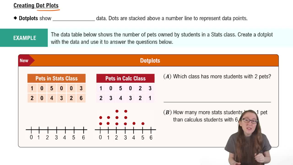
Dot Plot
A dot plot is a simple graphical display used to represent individual data points in a dataset. Each value is represented by a dot above a number line, allowing for easy visualization of frequency and distribution. This type of graph is particularly useful for small datasets, as it clearly shows the occurrence of each value and helps identify patterns or clusters in the data.
Recommended video:

Creating Dotplots
Data Distribution
Data distribution refers to the way in which data values are spread or arranged across a range. Understanding the distribution helps in identifying patterns such as central tendency, variability, and the presence of outliers. In the context of the life spans of houseflies, analyzing the distribution can reveal insights about the typical lifespan and any variations among the flies.
Recommended video:
Guided course

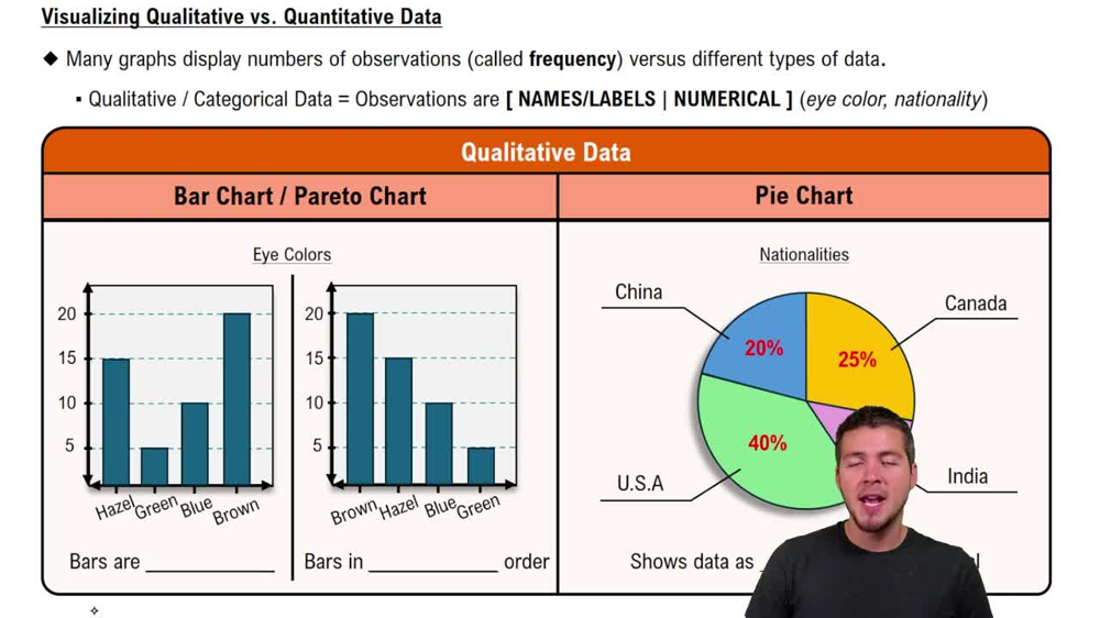
Visualizing Qualitative vs. Quantitative Data
Patterns in Data
Patterns in data refer to recognizable trends or regularities that emerge when data is visualized. These can include clusters, gaps, or overall shapes in the graph. Identifying patterns is crucial for drawing conclusions and making predictions based on the data, as it helps to understand the underlying characteristics of the dataset, such as common life spans among houseflies.
Recommended video:
Guided course

Visualizing Qualitative vs. Quantitative Data
Related Videos
Related Practice
Multiple Choice
96
views


