Table of contents
- 1. Intro to Stats and Collecting Data(0)
- 2. Describing Data with Tables and Graphs(0)
- 3. Describing Data Numerically(0)
- 4. Probability(0)
- 5. Binomial Distribution & Discrete Random Variables(0)
- 6. Normal Distribution and Continuous Random Variables(0)
- 7. Sampling Distributions & Confidence Intervals: Mean(0)
- 8. Sampling Distributions & Confidence Intervals: Proportion(0)
- 9. Hypothesis Testing for One Sample(0)
- 10. Hypothesis Testing for Two Samples(0)
- 11. Correlation(0)
- 12. Regression(0)
- 13. Chi-Square Tests & Goodness of Fit(0)
- 14. ANOVA(0)
2. Describing Data with Tables and Graphs
Visualizing Qualitative vs. Quantitative Data
2. Describing Data with Tables and Graphs
Visualizing Qualitative vs. Quantitative Data: Videos & Practice Problems
30 of 0
Problem 30Multiple Choice
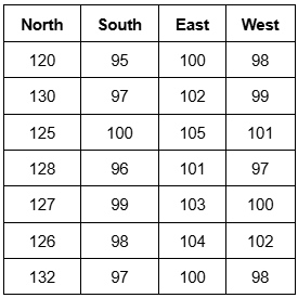
A city council is analyzing water usage fees in four different neighborhoods: North, South, East, and West. Residents of the North neighborhood have complained that their monthly water bills are higher than those in other areas. You collect a random sample of monthly water bills from each neighborhood, ensuring all homes are of similar size and usage. Which type of graph would best display this data for comparison?

0 Comments