 Back
BackVisualizing and Describing Categorical Data: Business Statistics Study Guide
Study Guide - Smart Notes
 Tailored notes based on your materials, expanded with key definitions, examples, and context.
Visualizing and Describing Categorical Data
Introduction to Categorical Data
Categorical data refers to variables that can be divided into groups or categories, such as gender, company, or survey responses. Understanding and visualizing categorical data is essential for making informed business decisions and communicating findings effectively.
Summarizing a Categorical Variable
To analyze categorical data, we often summarize it using frequency tables, which record the counts or percentages for each category. This helps us gain insights into the distribution and preferences within a dataset.
Frequency Table: A table that lists each category and the number of occurrences (counts) or the percentage of total responses.
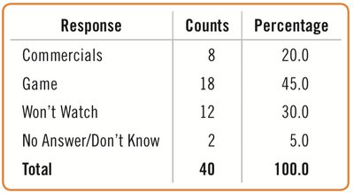
Example: Survey responses about why people watch the Super Bowl can be summarized in a frequency table.
Response | Counts | Percentage |
|---|---|---|
Commercials | 8 | 20.0 |
Game | 18 | 45.0 |
Won't Watch | 12 | 30.0 |
No Answer/Don't Know | 2 | 5.0 |
Total | 40 | 100.0 |
Displaying Categorical Data
Visualizing categorical data helps reveal patterns and makes it easier to communicate findings. Common methods include bar charts, relative frequency bar charts, and pie charts.
Bar Chart: Displays counts for each category side by side for easy comparison.
Relative Frequency Bar Chart: Shows the proportion (percentage) of each category instead of counts.
Pie Chart: Represents the whole group as a circle, with slices proportional to the fraction in each category.
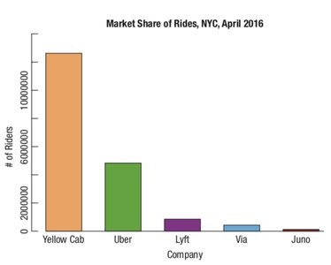
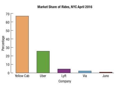
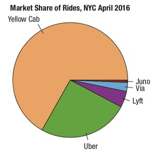
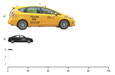
The Area Principle
The area principle states that the area occupied by a part of a graph should correspond to the magnitude of the value it represents. Misleading graphics violate this principle and can distort interpretation.
Example: A graphic with car images sized disproportionately to their market share can mislead viewers.
Rules for Displaying Categorical Data
Categorical Data Condition: Data must be counts or percentages of individuals in categories.
Non-overlapping Categories: Ensure categories are distinct and do not overlap.
Purpose: Consider what you are attempting to communicate about the data.
Exploring Relationships Between Two Categorical Variables: Contingency Tables
Contingency tables are used to show how two categorical variables are related. They display the distribution of individuals along each variable depending on the value of the other variable.
Marginal Distribution: The total count for each variable when the value of the other variable is held constant.
Cell Counts: Each cell shows the count for a combination of values of the two variables.
Percentages: Tables may display total percent, row percent, or column percent.
Used Ride-Hailing App? | Denmark | France | Germany | Greece | Italy | Netherlands | Norway | Poland | Portugal | Russia | Spain | Sweden | United Kingdom | Total |
|---|---|---|---|---|---|---|---|---|---|---|---|---|---|---|
No | 845 | 893 | 817 | 516 | 866 | 866 | 754 | 826 | 634 | 492 | 510 | 813 | 410 | 10803 |
Yes | 206 | 191 | 183 | 135 | 132 | 135 | 250 | 273 | 370 | 273 | 506 | 215 | 215 | 2733 |
Total | 1051 | 1084 | 1000 | 651 | 998 | 1001 | 1004 | 1099 | 1004 | 765 | 1016 | 1028 | 625 | 13336 |
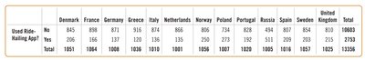
Conditional Distributions
Conditional distributions show the distribution for cases that satisfy a specified condition. By comparing conditional frequencies, we can identify patterns and associations between variables.
Example: Comparing ride-hailing app usage across countries reveals that Russia has the highest percentage of users.
Independence in Contingency Tables
Variables are independent if the distribution of one variable is the same for all categories of the other variable. If distributions differ, there is an association between the variables.
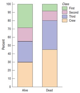
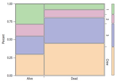
Segmented Bar Charts and Mosaic Plots
Segmented bar charts and mosaic plots are advanced visualizations for conditional distributions. Segmented bar charts divide each bar proportionally into segments for each group, while mosaic plots adjust bar widths to reflect group sizes, obeying the area principle.
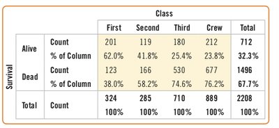
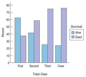
Example: Titanic survival data can be visualized to show the association between ticket class and survival.
Class | First | Second | Third | Crew | Total |
|---|---|---|---|---|---|
Alive | 201 (62.0%) | 119 (41.8%) | 180 (25.4%) | 212 (23.8%) | 712 (32.3%) |
Dead | 123 (38.0%) | 166 (58.2%) | 530 (74.6%) | 677 (76.2%) | 1496 (67.7%) |
Total | 324 | 285 | 710 | 889 | 2208 |
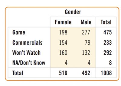
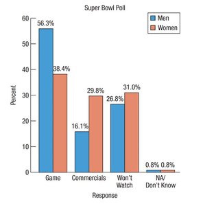
Association Between Categorical Variables
To determine if there is an association between two categorical variables, such as interest in the Super Bowl and gender, we can use contingency tables and bar charts to compare distributions.
Gender | Female | Male | Total |
|---|---|---|---|
Game | 198 | 277 | 475 |
Commercials | 154 | 79 | 233 |
Won't Watch | 160 | 132 | 292 |
NA/Don't Know | 4 | 4 | 8 |
Total | 516 | 492 | 1008 |
Key Terms and Formulas
Frequency: The number of times a category appears in the data.
Relative Frequency: The proportion of the total represented by each category.
Conditional Distribution: The distribution of a variable restricted to cases satisfying a condition.
Marginal Distribution: The totals for each variable in a contingency table.
Independence: No association between two categorical variables if distributions are the same across categories.
Summary
Visualizing and describing categorical data is fundamental in business statistics. Frequency tables, bar charts, pie charts, and contingency tables are essential tools for summarizing and exploring relationships in categorical data. Advanced visualizations like segmented bar charts and mosaic plots help reveal associations and patterns, supporting data-driven business decisions.
