 Back
BackStep-by-Step Guidance for ECON-2301 Macro Midterm (Chapters 1–4)
Study Guide - Smart Notes
 Tailored notes based on your materials, expanded with key definitions, examples, and context.
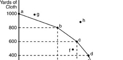
Q9. Which of the following would NOT allow society to move to point "h" in the above figure?
Background
Topic: Production Possibilities Curve (PPC)
This question tests your understanding of what causes an economy to move beyond its current production possibilities frontier (PPF), which represents the maximum efficient combinations of two goods that can be produced with available resources and technology.
Key Terms and Concepts:
Production Possibilities Curve (PPC): A graph showing the maximum combinations of goods/services that can be produced with fixed resources and technology.
Point "h": A point outside the PPC, representing a level of production unattainable with current resources and technology.
Economic Growth: An outward shift of the PPC, usually due to more resources or better technology.
Step-by-Step Guidance
Examine the PPC and identify where point "h" is located. Notice that it is outside the current curve, meaning it is unattainable with current resources and technology.
Consider what can shift the PPC outward, making point "h" attainable. These include increases in resources (like labor or capital) or improvements in technology.
Review the answer choices and determine which ones would allow the PPC to shift outward (making "h" attainable) and which would not.
Think about which option only improves efficiency with current resources (moving from inside the curve to the curve itself), but does not shift the curve outward.
Try solving on your own before revealing the answer!
Final Answer: A) more efficient use of current resources
More efficient use of current resources moves production from inside the curve to the curve, but does not shift the curve outward to make point "h" attainable. Only increases in resources or technology can do that.
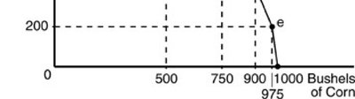
Q16. Refer to the above figure. Which panel demonstrates the law of demand?
Background
Topic: Law of Demand
This question tests your ability to recognize the graphical representation of the law of demand, which states that, ceteris paribus, as the price of a good falls, the quantity demanded rises (and vice versa).
Key Terms and Concepts:
Law of Demand: There is an inverse relationship between price and quantity demanded.
Demand Curve: Typically downward sloping from left to right.
Step-by-Step Guidance
Look at each panel and identify which one shows a downward-sloping line, indicating that as price decreases, quantity increases.
Recall that the law of demand is represented by a negatively sloped (downward) demand curve.
Eliminate any panels that show a vertical or horizontal line, as these do not represent the law of demand.
Focus on the panel that best matches the standard demand curve shape.
Try solving on your own before revealing the answer!
Final Answer: A) Panel A
Panel A shows a downward-sloping demand curve, which illustrates the law of demand: as price falls, quantity demanded rises.
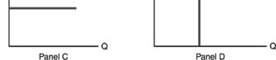
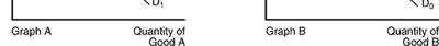
Q21. In the above figure, when the price of Good B increases, the result can be shown by
Background
Topic: Demand Curve Shifts and Movements
This question tests your understanding of how changes in the price of a related good (substitute or complement) affect the demand curve for another good.
Key Terms and Concepts:
Substitute Goods: Goods that can replace each other; an increase in the price of one increases demand for the other.
Movement Along the Curve: Caused by a change in the good's own price.
Shift of the Curve: Caused by changes in other factors (like the price of related goods).
Step-by-Step Guidance
Identify which graph shows a shift in the demand curve (not just a movement along the same curve).
Recall that an increase in the price of a substitute good causes the demand curve for the other good to shift rightward.
Look for the answer choice that describes a shift from one demand curve to another, not just a movement along a single curve.
Match the correct movement or shift to the scenario described in the question.
Try solving on your own before revealing the answer!
Final Answer: B) the movement along D0 from P1 to P2.
An increase in the price of Good B (a substitute) leads to a movement along the demand curve for Good B, but a shift in the demand curve for Good A. The correct answer reflects the movement described in the question.
Q24. Refer to the above figure. Plastic is an input for producing cellphones. Which diagram shows the effect on the supply of cellphones when the price of plastic has increased?
Background
Topic: Supply Curve Shifts
This question tests your understanding of how changes in input prices affect the supply curve for a good.
Key Terms and Concepts:
Input Prices: Costs of resources used to produce goods. An increase in input prices decreases supply.
Supply Curve Shift: An increase in input prices shifts the supply curve to the left (decrease in supply).
Step-by-Step Guidance
Identify which graph shows a leftward shift of the supply curve (from S1 to S2).
Recall that an increase in the price of an input (like plastic) makes production more expensive, reducing supply.
Look for the diagram where the supply curve shifts left, indicating a decrease in supply at every price level.
Match the correct graph to the scenario described in the question.
Try solving on your own before revealing the answer!
Final Answer: B) graph D
Graph D shows a leftward shift of the supply curve, which is what happens when the price of an input increases.
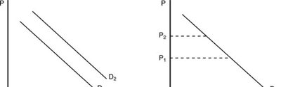
Q25. At a price of P0 in the above figure, which of the following statements is FALSE?
Background
Topic: Market Equilibrium
This question tests your understanding of equilibrium price and quantity, and how to interpret supply and demand graphs.
Key Terms and Concepts:
Equilibrium Price (P0): The price at which quantity demanded equals quantity supplied.
Surplus: Occurs when quantity supplied exceeds quantity demanded at a given price.
Market Clearing Price: The price at which there is no surplus or shortage.
Step-by-Step Guidance
Identify the equilibrium price and quantity on the graph (where supply and demand intersect).
Review each statement and determine if it accurately describes what happens at P0.
Recall that at equilibrium, there is no surplus or shortage.
Find the statement that contradicts the definition of equilibrium.
Try solving on your own before revealing the answer!
Final Answer: C) There is a surplus equal to Q0.
At the equilibrium price (P0), quantity demanded equals quantity supplied, so there is no surplus. The statement is false.
