 Back
BackMicroeconomics Practice Exam Guidance
Study Guide - Smart Notes
 Tailored notes based on your materials, expanded with key definitions, examples, and context.
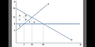
Q12. Which of the following represents deadweight loss due to forgone trade from the price ceiling?
Background
Topic: Price Ceilings and Deadweight Loss
This question tests your understanding of how price ceilings create inefficiencies in the market, specifically deadweight loss, which is the loss of total surplus due to trades that no longer occur.
Key Terms and Concepts:
Price Ceiling: A legal maximum price set below the equilibrium price, causing shortages.
Deadweight Loss: The reduction in total surplus (consumer + producer surplus) due to market inefficiency.
Surplus: The benefit consumers and producers receive from trading at market prices.
Step-by-Step Guidance
Examine the supply and demand graph. Identify the equilibrium price and quantity (where S and D intersect).
Locate the price ceiling (horizontal line at $8) and note the new quantity supplied and demanded at this price.
Deadweight loss is the area representing the trades that would have occurred at equilibrium but are now prevented by the price ceiling. These are typically triangles or regions between the new and old quantities.
Look for the labeled areas (A, B, C, D, E, F, G) and determine which ones are between the equilibrium and the price ceiling quantities, but not part of consumer or producer surplus.
Try solving on your own before revealing the answer!
Final Answer: c. F and G
F and G represent the deadweight loss due to forgone trade from the price ceiling. These areas are lost surplus that would have been gained if the market operated at equilibrium.
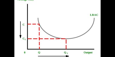
Q26. When does this average cost curve exhibit economies of scale?
Background
Topic: Economies of Scale and Cost Curves
This question tests your understanding of the long-run average cost (LRAC) curve and the concept of economies of scale, which occur when increasing output lowers average cost.
Key Terms and Concepts:
Economies of Scale: When increasing production leads to lower average costs.
LRAC Curve: Shows the lowest possible average cost for each output level in the long run.
Step-by-Step Guidance
Look at the LRAC curve. Economies of scale are present where the curve is downward sloping (average cost decreases as output increases).
Identify the range of output where LRAC is falling—from the leftmost point up to the minimum point.
Find the points labeled Q and Q2. The curve between 0 and Q2 is where economies of scale occur.
After Q2, the curve starts to rise, indicating diseconomies of scale (average cost increases as output increases).
Try solving on your own before revealing the answer!
Final Answer: c. From 0 to Q2
Economies of scale are exhibited from 0 to Q2, where the LRAC curve is downward sloping.
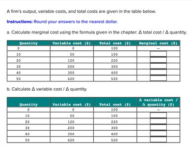
Q32. What is the marginal cost for the 30th unit? (Try and find all the MC also)
Background
Topic: Marginal Cost Calculation
This question tests your ability to calculate marginal cost, which is the additional cost incurred by producing one more unit of output.
Key Terms and Formulas:
Marginal Cost (MC): The change in total cost divided by the change in quantity.
Step-by-Step Guidance
Find the total cost for the 20th and 30th units. Calculate the change in total cost: .
Calculate the change in quantity: .
Plug these values into the marginal cost formula: .
Repeat this process for each interval in the table to find all marginal costs.
Try solving on your own before revealing the answer!
Final Answer: b. 8
The marginal cost for the 30th unit is $8, calculated using the formula above.
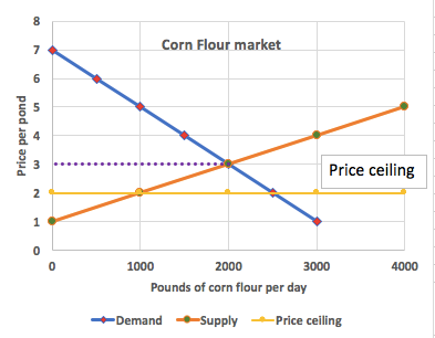
Q49. Consider the market for corn flour below and assume that a price ceiling of $2 is imposed. Calculate the deadweight loss:
Background
Topic: Price Ceilings and Deadweight Loss
This question tests your ability to identify and calculate deadweight loss in a market with a price ceiling, using supply and demand curves.
Key Terms and Concepts:
Price Ceiling: A legal maximum price, often set below equilibrium.
Deadweight Loss: The loss in total surplus due to market inefficiency.
Step-by-Step Guidance
Identify the equilibrium price and quantity from the graph (where supply and demand intersect).
Find the new quantity supplied and demanded at the price ceiling ($2).
Deadweight loss is the area between the supply and demand curves from the new quantity up to the equilibrium quantity.
Use the area of a triangle formula to calculate deadweight loss: .
Try solving on your own before revealing the answer!
Final Answer: b. The deadweight loss is $1,500
Deadweight loss is calculated using the area between the supply and demand curves at the price ceiling.
Q50. The opportunity cost of increasing production from 7 to 9 trucks is:
Background
Topic: Opportunity Cost and Production Possibilities Frontier (PPF)
This question tests your understanding of opportunity cost as illustrated by movements along a PPF.
Key Terms and Concepts:
Opportunity Cost: The value of the next best alternative foregone.
PPF: Shows the trade-offs between two goods.
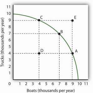
Step-by-Step Guidance
Locate the points on the PPF corresponding to 7 and 9 trucks.
Find the number of boats produced at each point.
Calculate the decrease in boats as trucks increase from 7 to 9. This difference is the opportunity cost.
Compare the options to see which matches the calculated opportunity cost.
Try solving on your own before revealing the answer!
Final Answer: b. 2 boats
The opportunity cost of increasing production from 7 to 9 trucks is 2 boats, as shown by the decrease in boats on the PPF.
