For the data points in the graphs below, which most likely suggests a quadratic relationship?
Table of contents
- 1. Intro to Stats and Collecting Data1h 14m
- 2. Describing Data with Tables and Graphs1h 55m
- 3. Describing Data Numerically2h 5m
- 4. Probability2h 16m
- 5. Binomial Distribution & Discrete Random Variables3h 6m
- 6. Normal Distribution and Continuous Random Variables2h 11m
- 7. Sampling Distributions & Confidence Intervals: Mean3h 23m
- Sampling Distribution of the Sample Mean and Central Limit Theorem19m
- Distribution of Sample Mean - Excel23m
- Introduction to Confidence Intervals15m
- Confidence Intervals for Population Mean1h 18m
- Determining the Minimum Sample Size Required12m
- Finding Probabilities and T Critical Values - Excel28m
- Confidence Intervals for Population Means - Excel25m
- 8. Sampling Distributions & Confidence Intervals: Proportion2h 10m
- 9. Hypothesis Testing for One Sample5h 8m
- Steps in Hypothesis Testing1h 6m
- Performing Hypothesis Tests: Means1h 4m
- Hypothesis Testing: Means - Excel42m
- Performing Hypothesis Tests: Proportions37m
- Hypothesis Testing: Proportions - Excel27m
- Performing Hypothesis Tests: Variance12m
- Critical Values and Rejection Regions28m
- Link Between Confidence Intervals and Hypothesis Testing12m
- Type I & Type II Errors16m
- 10. Hypothesis Testing for Two Samples5h 37m
- Two Proportions1h 13m
- Two Proportions Hypothesis Test - Excel28m
- Two Means - Unknown, Unequal Variance1h 3m
- Two Means - Unknown Variances Hypothesis Test - Excel12m
- Two Means - Unknown, Equal Variance15m
- Two Means - Unknown, Equal Variances Hypothesis Test - Excel9m
- Two Means - Known Variance12m
- Two Means - Sigma Known Hypothesis Test - Excel21m
- Two Means - Matched Pairs (Dependent Samples)42m
- Matched Pairs Hypothesis Test - Excel12m
- Two Variances and F Distribution29m
- Two Variances - Graphing Calculator16m
- 11. Correlation1h 24m
- 12. Regression3h 33m
- Linear Regression & Least Squares Method26m
- Residuals12m
- Coefficient of Determination12m
- Regression Line Equation and Coefficient of Determination - Excel8m
- Finding Residuals and Creating Residual Plots - Excel11m
- Inferences for Slope31m
- Enabling Data Analysis Toolpak1m
- Regression Readout of the Data Analysis Toolpak - Excel21m
- Prediction Intervals13m
- Prediction Intervals - Excel19m
- Multiple Regression - Excel29m
- Quadratic Regression15m
- Quadratic Regression - Excel10m
- 13. Chi-Square Tests & Goodness of Fit2h 21m
- 14. ANOVA2h 28m
12. Regression
Quadratic Regression
Problem 10.5.13
Textbook Question
Finding the Best Model
In Exercises 5–16, construct a scatterplot and identify the mathematical model that best fits the given data. Assume that the model is to be used only for the scope of the given data, and consider only linear, quadratic, logarithmic, exponential, and power models.
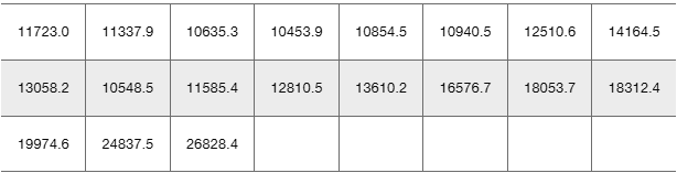
Stock Market Listed below in order by row are the annual high values of the Dow Jones Industrial Average for each year beginning with 2000. Find the best model and then predict the value for the last year listed. Is the predicted value close to the actual value of 26,828.4?

Verified step by step guidance1
Step 1: Organize the data by assigning each year a corresponding x-value starting from 1 for the year 2000, 2 for 2001, and so on, and the annual high values as y-values. This will help in plotting the scatterplot.
Step 2: Construct a scatterplot by plotting the years (x-values) on the horizontal axis and the Dow Jones annual high values (y-values) on the vertical axis to visually inspect the pattern or trend in the data.
Step 3: Consider the five types of models: linear, quadratic, logarithmic, exponential, and power. For each model, fit the data using appropriate regression techniques or software to find the best-fitting curve.
Step 4: Compare the goodness of fit for each model using criteria such as the coefficient of determination (R-squared) or residual plots to identify which model best captures the trend in the data within the given range.
Step 5: Use the best-fitting model to predict the Dow Jones value for the last year listed (corresponding to the x-value for that year). Then, compare this predicted value to the actual value of 26,828.4 to assess the accuracy of the model.
Verified video answer for a similar problem:This video solution was recommended by our tutors as helpful for the problem above
Video duration:
3mPlay a video:
0 Comments
Key Concepts
Here are the essential concepts you must grasp in order to answer the question correctly.
Scatterplot Construction
A scatterplot is a graphical representation of data points plotted on a coordinate plane, showing the relationship between two variables. It helps visualize patterns, trends, or correlations, which is essential for selecting an appropriate mathematical model.
Recommended video:
Guided course
Scatterplots & Intro to Correlation
Model Selection and Types
Choosing the best model involves comparing different types such as linear, quadratic, logarithmic, exponential, and power models. Each model describes data behavior differently, and the best fit minimizes errors and accurately represents the data within the given scope.
Recommended video:
Guided course
Types of Data
Prediction and Model Validation
After fitting a model, it is used to predict values within the data range. Comparing predicted values to actual data, like the Dow Jones value of 26,828.4, validates the model's accuracy and reliability for forecasting.
Recommended video:
Guided course
Prediction Intervals
Watch next
Master Quadratic Regression Using TI-84 with a bite sized video explanation from Patrick
Start learningRelated Videos
Related Practice
Multiple Choice
45
views
