 Back
BackChapter 4: Correlation and Linear Regression – Structured Study Notes
Study Guide - Smart Notes
 Tailored notes based on your materials, expanded with key definitions, examples, and context.
Correlation and Linear Regression
Scatterplots: Visualizing Relationships
Scatterplots are essential for displaying the relationship between two quantitative variables. They help identify trends, patterns, and associations, and are the primary tool for visualizing correlation and regression.
Direction: Patterns running from upper left to lower right indicate a negative association; lower left to upper right indicate a positive association.
Form: A linear form appears as a cloud of points stretched in a straight line. Nonlinear forms may curve gently or sharply.
Strength: Points tightly clustered indicate a strong relationship; widely spread points indicate a weak relationship.
Outliers: Unusual observations that stand away from the overall pattern.
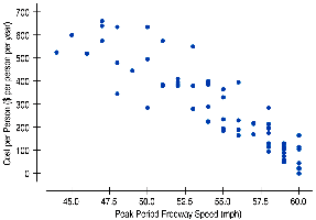
Example: Congestion Cost vs Freeway Speed
The scatterplot shows a strong, negative, linear relationship: as freeway speed increases, congestion cost per person decreases.

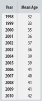
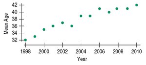
Example: Age of Cyclists
The mean age of cyclist traffic deaths has been increasing almost linearly over time, indicating a strong positive trend.
Assigning Roles to Variables in Scatterplots
When constructing a scatterplot, assign one variable to the x-axis (explanatory/predictor) and the other to the y-axis (response). Always label axes and include units.
Coordinates: Each point is placed at (x, y), representing the values of the two variables.
Explanatory vs Response: The explanatory variable (independent) is on the x-axis; the response variable (dependent) is on the y-axis.

Example: Age of Cyclists
Year is plotted on the x-axis as the predictor, and mean age on the y-axis as the response, reflecting how age changes over time.
Understanding Correlation
Correlation quantifies the strength and direction of a linear association between two quantitative variables. The correlation coefficient, r, is calculated using standardized values:
Formula:
Properties: r ranges from -1 to +1, has no units, and is unaffected by changes in scale or center.
Conditions: Only applies to quantitative variables, requires linearity, and is sensitive to outliers.
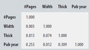
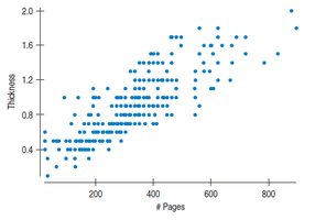
Correlation Table Example
Correlation tables summarize the pairwise correlations between variables in a dataset.
#Pages | Width | Thick | Pub year |
|---|---|---|---|
1.000 | 0.003 | 0.813 | 0.253 |
0.003 | 1.000 | 0.074 | 0.012 |
0.813 | 0.074 | 1.000 | 0.309 |
0.253 | 0.012 | 0.309 | 1.000 |
Lurking Variables and Causation
A high correlation does not imply causation. Lurking variables may influence both observed variables, creating a spurious association.
Lurking Variable: An unobserved variable that affects both x and y.
Example: Higher standards of living may increase both life expectancy and the number of doctors, but sending more doctors does not necessarily increase life expectancy.
The Linear Model
Linear regression models the relationship between two variables with a straight line. The model predicts y from x using estimated parameters.
Equation:
Residual: (difference between observed and predicted values)
Least Squares Line: The line that minimizes the sum of squared residuals.

Correlation and the Regression Line
The slope and intercept of the regression line can be calculated using correlation and standard deviations:
Slope:
Intercept:
Interpretation: The slope indicates the expected change in y for a unit change in x.

Regression to the Mean
Regression to the mean describes the tendency for predicted values to be closer to the mean than the corresponding x-values, since r cannot exceed 1.
Standardized Regression: For an observation 1 SD above the mean in x, y is predicted to be r SDs above the mean.
Checking the Model
Assessing the quality of a regression model involves checking several conditions:
Quantitative Data Condition: Only use linear models for quantitative data.
Linearity Condition: The relationship must be linear.
Outlier Condition: Outliers can distort the model.
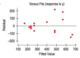
Equal Spread Condition: Residuals should have constant variance across all x-values.
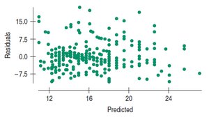
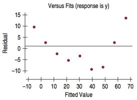
Example: Age of Cyclists Residuals
The residual plot shows remaining patterns, suggesting further analysis is needed.

Variation in the Model and R2
R2 (coefficient of determination) measures the fraction of variation in y explained by the regression model:
Formula:
Interpretation: R2 ranges from 0 to 1. Higher values indicate a better fit.
Example: For cyclist data, r = 0.96, so R2 = 0.92. This means 92% of the variation in mean age is explained by the trend over time.


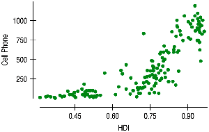
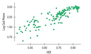
Nonlinear Relationships
Linear regression is only appropriate for linear relationships. For nonlinear associations, consider transforming variables or using nonlinear models.
Transformation: Apply functions like logarithm, square root, or reciprocal to achieve linearity.
Interpretation: Results must be interpreted in terms of transformed variables.


Best Practices and Common Pitfalls
Do not confuse correlation with association or causation.
Do not correlate categorical variables.
Always check for linearity and outliers.
Do not fit a straight line to a nonlinear relationship.
Do not extrapolate far beyond the data.
Do not choose a model based solely on R2.
Summary of Key Concepts
Use scatterplots to visualize relationships between quantitative variables.
Summarize linear relationships with correlation (r).
Model linear relationships with least squares regression.
Interpret slope, intercept, and R2 in context.
Check residuals to assess model quality.
Recognize regression to the mean and nonlinear relationships.
