 Back
BackCorrelation: Concepts, Calculation, and Interpretation in Statistics
Study Guide - Smart Notes
 Tailored notes based on your materials, expanded with key definitions, examples, and context.
Correlation
Overview of Correlation
Correlation is a statistical measure that describes the strength and direction of a relationship between two quantitative variables. It is a fundamental concept in statistics, especially when analyzing paired data to determine if and how strongly variables are related.
Scatterplots are used to visually display the relationship between two quantitative variables.
Pearson’s correlation coefficient (r) quantifies the strength and direction of a linear relationship.
Correlation vs. Causation: Correlation does not imply that one variable causes changes in another.
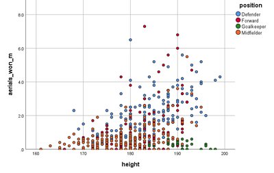
Scatterplots
A scatterplot is a graphical representation that shows the relationship between two quantitative variables. Each point represents an observation in the dataset, with its position determined by the values of the two variables.
Purpose: To visually assess the form, direction, and strength of a relationship.
Interpretation: Patterns may suggest linear, non-linear, or no association.
Example: Plotting height versus number of aerials won in football players to see if taller players win more aerials.
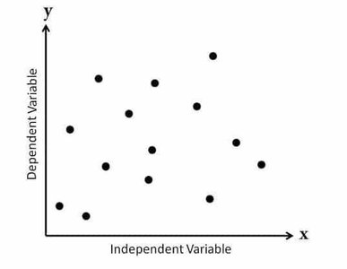
No Relationship: If the points are randomly scattered, there is no apparent association.
Pearson’s Correlation Coefficient (r)
Pearson’s correlation coefficient, denoted as r, provides a numerical summary of the strength and direction of a linear relationship between two quantitative variables. The value of r ranges from -1 to +1.
Formula:
Assumptions: Data should be approximately normally distributed and observations should be independent.
Interpretation:
If r is close to 0: No linear relationship.
If r is close to +1: Strong positive linear relationship.
If r is close to -1: Strong negative linear relationship.
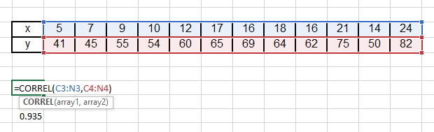
Worked Example: Calculating Pearson’s r
Given the following data:
x | 5 | 7 | 9 | 10 | 12 | 17 | 16 | 18 | 16 | 21 | 14 | 24 |
|---|---|---|---|---|---|---|---|---|---|---|---|---|
y | 41 | 45 | 55 | 54 | 60 | 65 | 69 | 64 | 62 | 75 | 50 | 82 |
Given: , ,
Calculation:
Interpretation: r = 0.94 indicates a strong positive linear relationship.
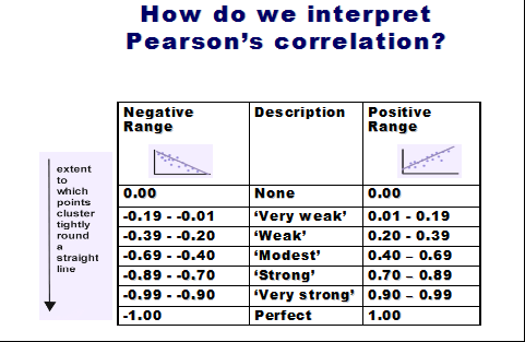
Interpreting Pearson’s r
The value of r can be interpreted using the following guidelines:
Negative Range | Description | Positive Range |
|---|---|---|
0.00 | None | 0.00 |
-0.19 to -0.01 | ‘Very weak’ | 0.01 to 0.19 |
-0.39 to -0.20 | ‘Weak’ | 0.20 to 0.39 |
-0.69 to -0.40 | ‘Modest’ | 0.40 to 0.69 |
-0.89 to -0.70 | ‘Strong’ | 0.70 to 0.89 |
-0.99 to -0.90 | ‘Very strong’ | 0.90 to 0.99 |
-1.00 | Perfect | 1.00 |
Examples of Correlation Interpretation
Given the following correlation values between variables x1 to x6 and y:
Variable | Correlation with y | Interpretation |
|---|---|---|
x1 | 0.65 | Moderate/strong positive linear relationship |
x2 | -0.12 | Very weak negative linear relationship |
x3 | -0.56 | Moderate negative linear relationship |
x4 | 0.78 | Strong positive linear relationship |
x5 | -0.35 | Weak negative linear relationship |
x6 | -0.85 | Strong negative linear relationship |
Limitations of Pearson’s Correlation
Pearson’s correlation coefficient is only valid when the data are approximately normally distributed and the relationship is linear. If the data are skewed or contain outliers, or if the relationship is non-linear, the value of r may be misleading.
Example: If age data is not normally distributed (e.g., clustered in early 20s with a few older individuals), Pearson’s r may not be valid.
Correlation Matrix Example: Beer Data
Correlation matrices summarize the pairwise correlations between several variables. For example, in a dataset of beers with variables such as calories, sodium, alcohol, and cost, the correlation matrix might look like:
calories | sodium | alcohol | cost | |
|---|---|---|---|---|
calories | 1.00 | 0.41 | 0.92 | 0.32 |
sodium | 0.41 | 1.00 | 0.32 | -0.44 |
alcohol | 0.92 | 0.32 | 1.00 | 0.33 |
cost | 0.32 | -0.44 | 0.33 | 1.00 |
Interpretation: There is a strong positive linear relationship between alcohol content and calories. Other correlations are weaker.
Correlation vs. Causation
It is crucial to understand that correlation does not imply causation. Two variables may be correlated due to coincidence, a third variable (confounder), or other factors. Careful interpretation is required to avoid incorrect conclusions about cause and effect.
Causation: X causes Y.
Common Response: Both X and Y respond to a third variable Z.
Confounding: The effect of X on Y is mixed with the effect of another variable Z.
Examples of Spurious Correlations:
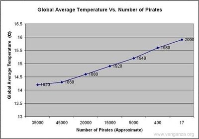
Decline in pirates is correlated with global warming.
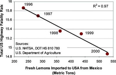
Importing Mexican lemons is correlated with reduced US highway fatalities.
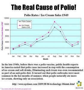
Ice cream sales and polio rates both increase in summer, but one does not cause the other.
When is Association Useful Without Proven Causality?
Even when causality is not established, associations can be useful for prediction and decision-making:
Insurance: Younger drivers are associated with higher accident rates, so they are charged higher premiums.
Flood Risk: Houses near rivers are associated with higher flood risk, affecting insurance costs.
Netflix: Uses correlations in viewing habits to recommend content and develop new series.
Summary
Pearson’s correlation coefficient (r) measures the strength and direction of a linear relationship between two quantitative variables.
Interpretation of r: Close to 0 (no linear relationship), close to +1 (strong positive), close to -1 (strong negative).
Correlation does not imply causation; always consider possible confounding variables and the context of the data.
