 Back
BackDescribing the Relation Between Two Variables: Scatter Diagrams, Correlation, and Regression
Study Guide - Smart Notes
 Tailored notes based on your materials, expanded with key definitions, examples, and context.
Describing the Relation Between Two Variables
Scatter Diagrams and Correlation
Understanding the relationship between two quantitative variables is fundamental in statistics. This section introduces scatter diagrams, correlation, and the interpretation of linear relationships.
Response Variable: The variable whose value is explained by the explanatory (predictor) variable.
Explanatory Variable: The variable that explains or influences changes in the response variable.
Scatter Diagrams
A scatter diagram is a graph that displays the relationship between two quantitative variables measured on the same individuals.
The explanatory variable is plotted on the horizontal axis, and the response variable is plotted on the vertical axis.
Scatter diagrams help identify the type of relationship: linear, nonlinear, or no relation.
Example: Investigating the relationship between club-head speed (mph) and golf ball distance (yards) using a controlled experiment.
Types of Association
Positive Association: As one variable increases, the other also increases.
Negative Association: As one variable increases, the other decreases.
Linear Correlation Coefficient
The linear correlation coefficient (Pearson's r) measures the strength and direction of the linear relationship between two quantitative variables.
Population correlation coefficient:
Sample correlation coefficient:
The formula for the sample correlation coefficient is:
are the individual sample values
are the sample means
are the sample standard deviations
is the sample size
Properties of the Linear Correlation Coefficient
indicates a perfect positive linear relation
indicates a perfect negative linear relation
close to 0 suggests little or no linear relation
is unitless and not resistant to outliers
Determining the Existence of a Linear Relation
Compare the absolute value of to a critical value (from statistical tables) based on sample size.
If is greater than the critical value, a linear relation exists.
Correlation vs. Causation
Correlation does not imply causation.
A lurking variable is an unmeasured variable that influences both the explanatory and response variables, potentially confounding results.
Example: Higher air-conditioning bills and crime rates are both influenced by temperature, a lurking variable.
Least-Squares Regression
Finding the Least-Squares Regression Line
The least-squares regression line is the line that minimizes the sum of the squared residuals (vertical distances between observed and predicted values).
The equation is:
(slope)
(y-intercept)
Interpretation of Slope and Intercept
Slope (): The average change in the response variable for each one-unit increase in the explanatory variable.
Y-intercept (): The predicted value of the response variable when the explanatory variable is zero (interpret only if zero is a reasonable value).
Making Predictions
Substitute a value of into the regression equation to predict .
Residual: The difference between the observed value and the predicted value ().
Example: Regression Output from Statistical Software
The following outputs show the results of fitting a simple linear regression model to the golf data (Distance vs. Club-Head Speed) using Excel, StatCrunch, and R:
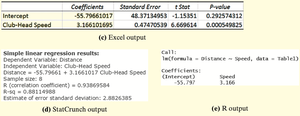
Regression Equation:
Interpretation: For each additional mile per hour in club-head speed, the distance increases by approximately 3.166 yards, on average.
Sum of Squared Residuals
The least-squares regression line minimizes the sum of squared residuals:
Any other line will have a larger sum of squared residuals.
Diagnostics on the Least-Squares Regression Line
Coefficient of Determination ()
Coefficient of determination (): Measures the proportion of total variation in the response variable explained by the regression line.
For example, means 88.2% of the variation in distance is explained by club-head speed.
Residual Analysis
Residual plots help assess the appropriateness of the linear model.
If residuals display no pattern and have constant variance, the linear model is appropriate.
Outliers and influential observations can be detected using residual plots and boxplots.
Influential Observations
An influential observation significantly affects the regression line's slope, intercept, or correlation coefficient.
Influence depends on the observation's leverage (distance from the mean of the explanatory variable) and residual size.
Influential points should only be removed with justification; otherwise, consider collecting more data or using robust methods.
Contingency Tables and Association
Contingency Tables
A contingency table (two-way table) displays the frequency distribution of two categorical variables.
Marginal distribution: The totals for each row or column, representing the distribution of one variable regardless of the other.
Conditional distribution: The distribution of one variable for a fixed value of the other variable.
Association Among Categorical Data
Conditional distributions can reveal associations between categorical variables.
For example, employment status is associated with level of education; higher education levels correspond to higher employment rates.
Simpson’s Paradox
Simpson’s Paradox: An association between two variables reverses or disappears when a third variable is considered.
Example: In university admissions, apparent gender bias disappears when program of study is included as a lurking variable.
Additional info: This summary covers the main concepts, definitions, and examples from Chapter 4, including scatter diagrams, correlation, regression, diagnostics, and contingency tables, with academic context added for clarity and completeness.
