 Back
BackChapter 4 STATS
Study Guide - Smart Notes
 Tailored notes based on your materials, expanded with key definitions, examples, and context.
Chapter 4: Describing the Relation Between Two Variables
Scatter Diagrams and Correlation
When analyzing data involving two quantitative variables measured on the same individual, it is essential to understand the relationship between them. This section introduces graphical and numerical methods for describing such bivariate data.
Scatter Diagrams
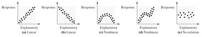
A scatter diagram is a graph that displays the relationship between two quantitative variables. Each point represents an individual in the data set, with the explanatory variable (independent variable) on the horizontal axis and the response variable (dependent variable) on the vertical axis.
Purpose: To visually assess the type of relationship (linear, nonlinear, or no relation) between two variables.
Interpretation: Patterns in the scatter diagram help distinguish between linear, nonlinear, and no association.
Example: Predicting home sale prices using Zestimate values, or analyzing drilling time versus depth.
Types of Association
Positive Association: Above-average values of one variable are associated with above-average values of the other. As one increases, so does the other.
Negative Association: Above-average values of one variable are associated with below-average values of the other. As one increases, the other decreases.
Properties of the Linear Correlation Coefficient
The linear correlation coefficient (Pearson product moment correlation coefficient) measures the strength and direction of the linear relationship between two quantitative variables. The population correlation coefficient is denoted by , and the sample correlation coefficient by .
Formula for Sample Correlation Coefficient:
: ith observation of explanatory variable
: sample mean of explanatory variable
: sample standard deviation of explanatory variable
: ith observation of response variable
: sample mean of response variable
: sample standard deviation of response variable
: number of individuals in the sample
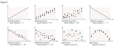
Interpretation of Correlation Coefficient
Range:
r = +1: Perfect positive linear relation
r = -1: Perfect negative linear relation
r close to +1: Strong positive association
r close to -1: Strong negative association
r close to 0: Little or no evidence of linear relation (but possibly nonlinear relation)
Unitless: The correlation coefficient is unitless.
Not Resistant: Outliers can significantly affect .
Correlation vs. Causation
Correlation does not imply causation. High correlation between two variables does not mean one causes the other. Causality can only be established through designed experiments, not observational data. Lurking variables may explain observed associations.
Example: Ice cream sales and crime rates are correlated due to temperature, a lurking variable.
Least-Squares Regression
The least-squares regression line is the line that best fits the data by minimizing the sum of squared residuals (errors). It is used to make predictions and interpret relationships between variables.
Equation of the Least-Squares Regression Line
: Slope
: y-intercept
Interpretation of Slope and y-Intercept
Slope: Represents the average change in the response variable for each unit increase in the explanatory variable.
y-Intercept: Represents the predicted value of the response variable when the explanatory variable is zero (if zero is a reasonable value).
Caution: Predictions outside the observed range (extrapolation) may not be valid.
Sum of Squared Residuals
The least-squares regression line minimizes the sum of squared residuals:
Any other line will have a greater sum of squared residuals.
The Coefficient of Determination ()
The coefficient of determination () measures the proportion of total variation in the response variable explained by the regression line.
Range:
Interpretation: means the line explains none of the variation; means it explains all the variation.
Calculation: For linear regression,
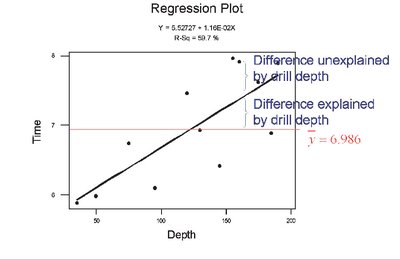
Decomposition of Variation
Total deviation:
Explained deviation:
Unexplained deviation:
Relationship:
Contingency Tables and Association
Contingency tables (two-way tables) relate two categorical variables and are used to analyze association among categorical data.
Marginal Distribution
Definition: Frequency or relative frequency distribution of either the row or column variable.
Example: Distribution of grades or delivery methods in a course effectiveness study.
Conditional Distribution
Definition: Relative frequency of each category of the response variable, given a specific value of the explanatory variable.
Purpose: To identify association between categorical variables.
Simpson’s Paradox
Simpson’s Paradox occurs when an association between two variables reverses or disappears when a third variable is introduced. This highlights the importance of considering lurking variables in data analysis.
Example: Survival rates for diabetes types appear different until age is considered, revealing a different association.
Type | Survived | Died | Total |
|---|---|---|---|
Type 1 | 253 | 105 | 358 |
Type 2 | 326 | 218 | 544 |
Total | 579 | 323 | 902 |
Additional info: When stratified by age, the association between diabetes type and mortality changes, illustrating Simpson's Paradox.
