 Back
BackDisplaying and Describing Categorical Data: Chapter 2 Study Notes
Study Guide - Smart Notes
 Tailored notes based on your materials, expanded with key definitions, examples, and context.
Displaying and Describing Categorical Data
Summarizing a Categorical Variable
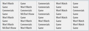
Categorical variables represent data that can be sorted into distinct groups or categories. Summarizing such data involves organizing the counts and proportions for each category, often using frequency tables.
Frequency Table: A frequency table lists each category and the number of occurrences (counts) and/or percentages for each.
Counts vs. Percentages: Tables may report raw counts, percentages, or both, depending on the context and the need for comparison.
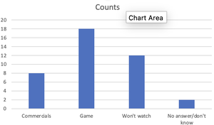
Example: Poll responses about Super Bowl interest can be summarized in a frequency table.
Application: Frequency tables are foundational for further graphical analysis and interpretation.
Displaying a Categorical Variable
Visual representations are essential for understanding and communicating categorical data. The three rules of data analysis emphasize the importance of making pictures to reveal patterns and features not easily seen in tables.
Area Principle: The area occupied by a part of a graph should correspond to the magnitude of the value it represents. Misleading visuals violate this principle.
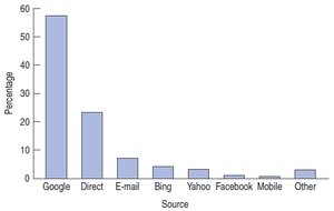
Bar Charts: Bar charts display counts for each category side by side, facilitating easy comparison.
Relative Frequency Bar Charts: These show proportions or percentages instead of counts.
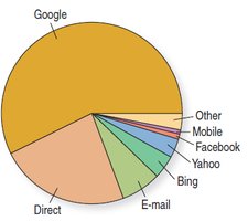
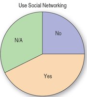
Pie Charts: Pie charts represent the whole group as a circle, with slices proportional to the fraction in each category.
Key Considerations: Data must satisfy the Categorical Data Condition (counts or percentages of individuals in categories, non-overlapping categories).
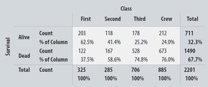
Exploring Two Categorical Variables: Contingency Tables
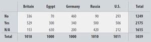
Contingency tables (also called two-way tables) are used to examine the relationship between two categorical variables. They show how individuals are distributed across combinations of categories.
Marginal Distribution: The totals for each category of a variable, found in the margins of the table.
Cell Counts: Each cell shows the count for a specific combination of categories.
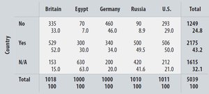
Percentages: Tables may display total percent, row percent, or column percent, depending on the reference group.
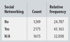
Example: Pew Research data on social networking use across countries.
Conditional Distributions and Independence
Conditional distributions restrict the data to cases that satisfy a specific condition, allowing for more focused analysis. Independence between variables is assessed by comparing conditional distributions.
Conditional Distribution: The distribution of one variable within each category of another variable.
Independence: If the conditional distributions are the same for all categories, the variables are independent (no association).
Example: Conditional distribution of social networking use by country.
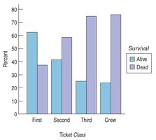
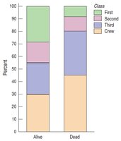
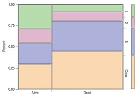
Segmented Bar Charts and Mosaic Plots
Segmented bar charts and mosaic plots are advanced graphical tools for visualizing conditional distributions and associations between categorical variables.
Segmented Bar Chart: Each bar represents a group and is divided into segments proportional to the percentage in each category.
Mosaic Plot: Similar to segmented bar charts but the width of each bar is proportional to the size of the group, better obeying the area principle.
Example: Titanic survival data by ticket class.
Simpson’s Paradox
Simpson’s Paradox occurs when combining percentages across different groups leads to misleading conclusions. This paradox highlights the importance of analyzing data within relevant subgroups.
Definition: Simpson’s Paradox is the phenomenon where a trend appears in several groups of data but disappears or reverses when the groups are combined.
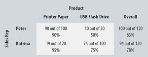
Example: Sales performance comparison between two representatives across different products.

Common Pitfalls in Displaying Categorical Data
Accurate representation of categorical data is crucial. Misleading visuals, improper combination of percentages, and insufficient sample sizes can distort findings.
Area Principle Violations: Ensure that graphical areas correspond to data values.
Honest Reporting: Avoid pie charts where percentages exceed 100% or slices are visually misleading.
Consistent Scales: Changing scales within a chart can mislead viewers.
Percentage Confusion: Clearly identify what each percentage represents.
Marginal and Conditional Distributions: Always examine variables separately and together.
Sample Size: Use sufficient data to ensure reliable conclusions.
Overstating Conclusions: Conclusions should be limited to what the data suggests.
Summary of Key Concepts
Frequency Tables: Summarize categorical data by counts and percentages.
Bar Charts and Pie Charts: Visualize categorical data using the area principle.
Contingency Tables: Explore relationships between two categorical variables.
Marginal and Conditional Distributions: Analyze distributions within and across categories.
Independence: Variables are independent if conditional distributions are similar across categories.
Simpson’s Paradox: Beware of misleading combined percentages.
Additional info: These notes expand on the original slides by providing definitions, examples, and academic context for each concept, ensuring completeness and clarity for exam preparation.
