 Back
BackDisplaying and Describing Categorical Data: Titanic Case Study and Contingency Tables
Study Guide - Smart Notes
 Tailored notes based on your materials, expanded with key definitions, examples, and context.
Displaying and Describing Categorical Data
Introduction to Categorical Data Visualization
Categorical data analysis is essential for understanding how groups or categories compare within a dataset. In statistics, visual displays and tables are used to summarize and interpret such data, revealing patterns and relationships that may not be obvious from raw numbers alone.
Visualizing Categorical Data: The Titanic Example
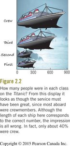
The Area Principle and Misleading Graphs
When displaying categorical data, it is crucial to ensure that the area representing each category is proportional to its value. Violating this principle can lead to misinterpretation.
Area Principle: The area occupied by a part of a graph should correspond to the magnitude of the value it represents.
Example: The Titanic ship graphic (see below) attempts to show the number of people in each class (Crew, Third, Second, First) by the size of ship icons. However, the area of each ship exaggerates the differences, making it appear as though the majority were crew, when in fact only about 40% were.
Contingency Tables: Summarizing Two Categorical Variables
Definition and Purpose
A contingency table (or two-way table) displays the frequency distribution of variables that are categorical. It allows us to examine the relationship between two categorical variables by showing the counts for each combination of categories.
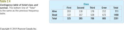
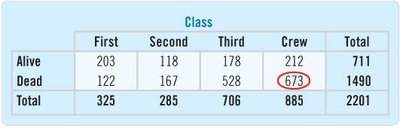
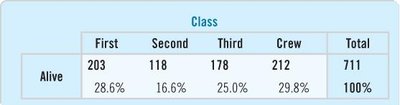
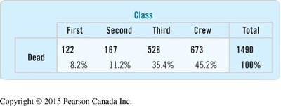
Example: Titanic Class and Survival
The table below summarizes the number of Titanic passengers and crew by class and survival status:
First | Second | Third | Crew | Total | |
|---|---|---|---|---|---|
Alive | 203 | 118 | 178 | 212 | 711 |
Dead | 122 | 167 | 528 | 673 | 1490 |
Total | 325 | 285 | 706 | 885 | 2201 |
Marginal and Joint Distributions
Marginal Distribution: The totals for each category (row or column), showing the overall distribution of a single variable.
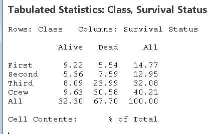
Joint Distribution: The proportion of cases falling into each combination of categories (cell), often expressed as a percentage of the total.
Example of joint distribution (percent of total):
First | Second | Third | Crew | All | |
|---|---|---|---|---|---|
Alive | 9.22 | 5.36 | 8.09 | 9.63 | 32.30 |
Dead | 5.54 | 7.59 | 23.99 | 30.58 | 67.70 |
All | 14.77 | 12.95 | 32.08 | 40.21 | 100.00 |
Conditional Distributions
A conditional distribution shows the distribution of one variable for individuals who satisfy a condition on another variable. For example, the distribution of class among survivors, or the survival rate within each class.
To compute the conditional distribution of class among survivors, divide the number of survivors in each class by the total number of survivors.
Example (percent of survivors by class):
First | Second | Third | Crew | Total | |
|---|---|---|---|---|---|
Alive | 28.6% | 16.6% | 25.0% | 29.8% | 100% |
Example (percent of deaths by class):
First | Second | Third | Crew | Total | |
|---|---|---|---|---|---|
Dead | 8.2% | 11.2% | 35.4% | 45.2% | 100% |
Using Statistical Software for Contingency Tables
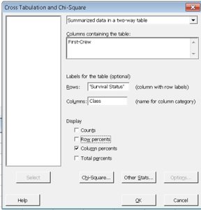
Statistical software (such as Minitab) can be used to generate contingency tables and calculate row, column, and total percentages. The following screenshots show how to set up cross-tabulation and select the appropriate display options:
To display row percentages (conditional on survival status):
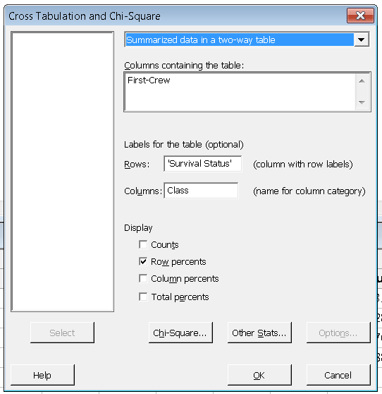
To display column percentages (conditional on class):
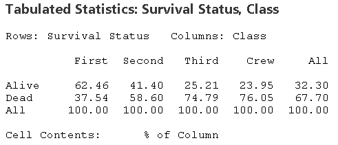
Interpreting Conditional Percentages
Conditional percentages help us understand the relationship between variables. For example, the survival rate within each class:
First | Second | Third | Crew | All | |
|---|---|---|---|---|---|
Alive | 62.46 | 41.40 | 25.21 | 23.95 | 32.30 |
Dead | 37.54 | 58.60 | 74.79 | 76.05 | 67.70 |
All | 100.00 | 100.00 | 100.00 | 100.00 | 100.00 |
Summary Table: Types of Distributions in Contingency Tables
Type | What it Shows | How to Calculate |
|---|---|---|
Marginal Distribution | Totals for each row or column | Sum counts across rows or columns, divide by grand total |
Joint Distribution | Proportion in each cell | Cell count divided by grand total |
Conditional Distribution | Distribution of one variable given a category of the other | Cell count divided by row or column total |
Key Points and Best Practices
Always check that the area principle is respected in visual displays.
Use contingency tables to explore relationships between two categorical variables.
Calculate and interpret marginal, joint, and conditional distributions to gain insights into the data.
Use statistical software to efficiently compute and visualize these distributions.
Be cautious of misleading graphics and always verify the underlying numbers.
Example Application
In the Titanic dataset, contingency tables and conditional distributions reveal that survival rates varied greatly by class, with first-class passengers having a much higher chance of survival than third-class passengers or crew. This kind of analysis is foundational for understanding associations in categorical data.
