 Back
BackDisplaying and Describing Quantitative Data: Study Notes
Study Guide - Smart Notes
 Tailored notes based on your materials, expanded with key definitions, examples, and context.
Chapter 3: Displaying and Describing Quantitative Data
3.1 Displaying Quantitative Variables
Quantitative data consists of numerical values that can be measured and ordered. To understand patterns and trends, it is essential to visualize these data using appropriate graphical methods.
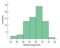
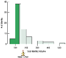
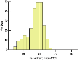
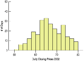
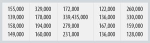
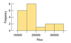
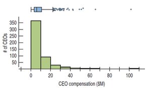
Histograms: A histogram is a graphical representation of the distribution of a quantitative variable. The data range is divided into intervals (bins), and the frequency of data within each bin is depicted by the height of the bar.
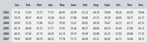

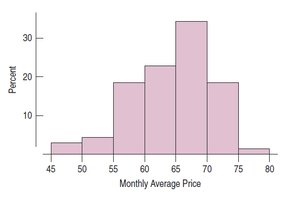
Relative Frequency Histograms: Similar to histograms, but the vertical axis shows the percentage of cases in each bin rather than the count.
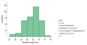
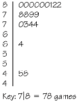
Stem-and-Leaf Displays: These provide a way to visualize the distribution while retaining the original data values. Each value is split into a 'stem' (leading digit(s)) and a 'leaf' (trailing digit).
Quantitative Data Condition: Only quantitative data with known units should be displayed using histograms or stem-and-leaf plots. Categorical data require bar or pie charts.
3.2 Shape of Distributions
Describing the shape of a distribution is crucial for understanding the underlying data. Key aspects include modes, symmetry, and outliers.
Modes: The peaks in a histogram are called modes. Distributions can be unimodal (one peak), bimodal (two peaks), or multimodal (more than two peaks).
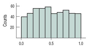
Uniform Distribution: A distribution where all bars are approximately the same height, indicating no apparent mode.
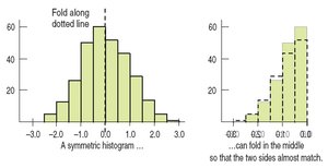
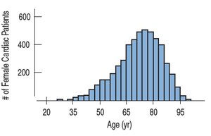
Symmetry: A distribution is symmetric if the left and right sides are mirror images.
Skewness: If one tail is longer, the distribution is skewed in that direction. Right-skewed means the right tail is longer; left-skewed means the left tail is longer.
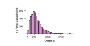
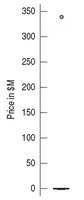
Outliers: Values that are far from the rest of the data. Outliers can affect statistical methods, may indicate errors, or provide important information.
Judgment in Describing Shape: Understanding the context and data collection method is important when characterizing the shape.
3.3 Center of a Distribution
The center of a distribution summarizes where most values are located. The two main measures are the mean and the median.
Mean (\( \bar{x} \)): The arithmetic average, calculated as:
The mean is best for unimodal, symmetric distributions.
Median: The middle value when data are ordered. The median is resistant to outliers and skewness.
If the distribution is symmetric, the mean and median are close.
3.4 Spread of the Distribution
Spread describes how much the data values vary. Common measures include range, interquartile range (IQR), and standard deviation.
Range: The difference between the maximum and minimum values.
Quartiles and IQR: Quartiles divide the data into four equal parts. The IQR is the range of the middle 50% of the data.
Standard Deviation (s): Measures the average distance of data values from the mean. The variance (\( s^2 \)) is the average squared deviation, and the standard deviation is its square root.
Standard deviation is best for symmetric distributions; IQR is better for skewed data or data with outliers.
3.5 Choosing Measures of Center and Spread
The choice of summary statistics depends on the shape of the distribution.
For skewed distributions, use the median and IQR.
For unimodal, symmetric distributions, use the mean and standard deviation (and possibly median and IQR).
Always pair the median with the IQR and the mean with the standard deviation.
Report outliers and consider their impact on summary statistics.
3.6 Standardizing Variables (z-scores)
Standardizing allows comparison of values from different distributions by expressing them in terms of standard deviations from the mean.
z-score: The standardized value is calculated as:
A z-score indicates how many standard deviations a value is from the mean. Positive z-scores are above the mean; negative are below.
z-scores are unitless and allow comparison across different variables.
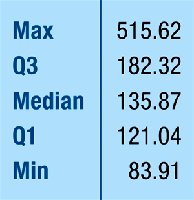
3.7 Five-Number Summary and Boxplots
The five-number summary provides a concise description of a distribution: minimum, first quartile (Q1), median, third quartile (Q3), and maximum.
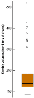
Boxplot: A graphical display of the five-number summary. The box shows the IQR, the line inside the box is the median, and whiskers extend to the most extreme non-outlier values. Outliers are plotted individually.
To construct a boxplot:
Draw an axis and mark the quartiles and median.
Draw a box from Q1 to Q3 and a line at the median.
Calculate fences (1.5 IQR above Q3 and below Q1) to identify outliers.
Draw whiskers to the most extreme values within the fences.
Plot outliers individually.
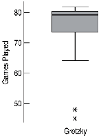
Boxplots are useful for identifying skewness, spread, and outliers.
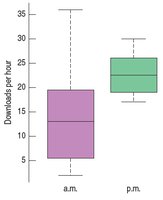
3.8 Comparing Groups
Comparing distributions across groups helps identify patterns and differences. Histograms and boxplots are commonly used for this purpose.
Side-by-side histograms are useful for comparing two groups.
Boxplots are more effective for comparing several groups simultaneously.
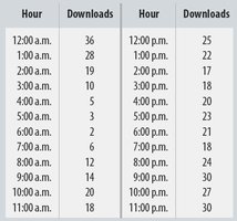
Example: Comparing a.m. and p.m. music downloads using boxplots.


3.9 Identifying Outliers
Outliers should be carefully examined to determine their cause and whether they should be included in the analysis.
Check for data entry errors or special circumstances that explain the outlier.
Outliers may be valid and provide important information about the data.

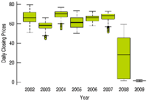
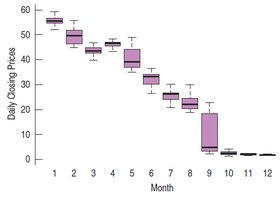
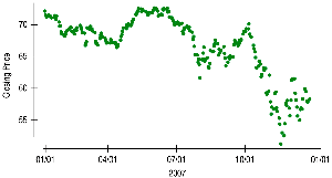
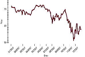
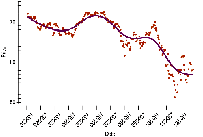
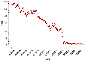
3.10 Time Series Plots
Time series plots display data points in chronological order, revealing trends, cycles, and other temporal patterns.
Time series plots can show both short-term variation and long-term trends.
Connecting points or adding a smooth trace can help visualize trends.
For non-stationary data (with trends or changing variability), time series plots are more informative than histograms.
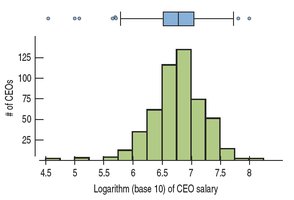
3.11 Transforming Skewed Data
When data are highly skewed, transformations can make the distribution more symmetric, facilitating analysis and interpretation.
Common transformations include logarithms and square roots for right-skewed data, and squaring for left-skewed data.
Transformation can clarify the center and spread and help identify outliers.
3.12 Common Pitfalls and Best Practices
Do not use histograms for categorical variables.
Choose appropriate and consistent scales for axes.
Label variables and axes clearly.
Check that numerical summaries make sense for the data type.
Be cautious with multiple modes and outliers; consider separating data if necessary.
Summary Table: Measures of Center and Spread
Distribution Shape | Center | Spread |
|---|---|---|
Unimodal, Symmetric | Mean | Standard Deviation |
Skewed or with Outliers | Median | IQR |
What Have We Learned?
How to make and interpret histograms and boxplots for quantitative data.
How to describe distributions in terms of shape, center, and spread.
How to compute and interpret mean, median, standard deviation, and IQR.
How to standardize values using z-scores for comparison.
How to use the five-number summary and boxplots to identify outliers.
How to compare distributions across groups and over time.
How to transform skewed data for better analysis.
