 Back
BackOrganizing and Summarizing Data: Graphical and Tabular Methods in Statistics
Study Guide - Smart Notes
 Tailored notes based on your materials, expanded with key definitions, examples, and context.
Chapter 2: Organizing and Summarizing Data
Section 2.1: Organizing Qualitative Data
Qualitative data, also known as categorical data, must be organized to facilitate analysis and interpretation. This section covers methods for summarizing qualitative data using tables and graphical displays.
Organizing Qualitative Data in Tables
Frequency Distribution: A table listing each category of data and the number of occurrences for each category.
Relative Frequency: The proportion (or percent) of observations within a category, calculated as:
Relative Frequency Distribution: A table listing each category with its relative frequency.
Example: A physical therapist records the body part requiring rehabilitation for 30 patients. The frequency and relative frequency distributions summarize the counts and proportions for each body part.
Constructing Bar Graphs
Bar Graph: Categories are labeled on one axis, and frequencies or relative frequencies on the other. Rectangles of equal width represent each category, with heights corresponding to the data values.
Pareto Chart: A bar graph with bars ordered in decreasing frequency or relative frequency.
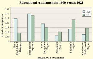
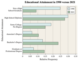
Side-by-Side Bar Graphs: Used to compare two or more groups (e.g., educational attainment in 1990 vs. 2021). Relative frequencies are preferred for comparison when group sizes differ.
Horizontal Bar Graphs: Useful when category names are lengthy.
Example: The side-by-side bar graph below compares educational attainment in 1990 and 2021, showing changes in the proportion of adults with various education levels.
Constructing Pie Charts
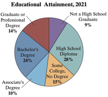
Pie Chart: A circle divided into sectors, each representing a category. The area of each sector is proportional to the category's frequency or relative frequency.
Degree Measure: For a category with relative frequency p, the sector's angle is degrees.
Example: The pie chart below displays the educational attainment of U.S. residents 25 years or older in 2021.
Section 2.2: Organizing Quantitative Data: The Popular Displays
Quantitative data can be discrete or continuous. The method of organization and graphical display depends on the type of data and the number of unique values.
Organizing Discrete Data in Tables
For discrete data with few unique values, each value forms a class in the frequency and relative frequency distributions.
Example: The number of customers arriving at a restaurant in 15-minute intervals is summarized in a frequency table.
Constructing Histograms of Discrete Data
Histogram: Rectangles represent classes of data. Heights correspond to frequencies or relative frequencies, and rectangles touch each other to indicate continuity.
Note: In histograms, rectangles touch; in bar graphs, they do not.
Organizing Continuous Data in Tables
Continuous data are grouped into intervals (classes) of equal width, except in open-ended tables.
Class Limits: The smallest and largest values in each class.
Class Width: The difference between consecutive lower class limits.
Guidelines: Choose 5–20 classes; select a convenient class width by rounding up the calculated value.
Constructing Histograms of Continuous Data
Similar to discrete data histograms, but classes are intervals.
Drawing Dot Plots
Dot Plot: Each observation is represented by a dot above its value on a horizontal axis. Useful for small data sets.
Identifying the Shape of a Distribution
Uniform Distribution: Frequencies are evenly spread.
Bell-Shaped Distribution: Highest frequency in the middle, tails off symmetrically.
Skewed Right: Tail extends to the right.
Skewed Left: Tail extends to the left.
Note: Shape identification is subjective and not used for qualitative data.
Section 2.3: Additional Displays of Quantitative Data
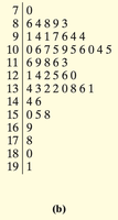
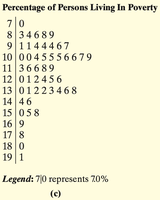
Drawing Stem-and-Leaf Plots
Stem-and-Leaf Plot: The leftmost digits form the stem; the rightmost digit forms the leaf. Preserves raw data while displaying distribution.
Steps:
Identify stems and leaves for each value.
Write stems in a vertical column.
List leaves for each stem.
Order leaves and add a legend.
Example: The following stem-and-leaf plots show the percentage of persons living in poverty by state in 2021.
Constructing Frequency Polygons
Frequency Polygon: A graph using points connected by line segments to represent class frequencies. Points are plotted at class midpoints.
Class Midpoint:
Creating Cumulative Frequency and Relative Frequency Tables
Cumulative Frequency Distribution: Shows the total number of observations less than or equal to each class/category.
Cumulative Relative Frequency Distribution: Shows the proportion (or percent) of observations less than or equal to each class/category.
Constructing Frequency and Relative Frequency Ogives
Ogive: A graph of cumulative frequency or cumulative relative frequency versus the upper class limits, connected by line segments.
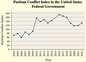
Drawing Time-Series Graphs
Time-Series Data: Values measured at different points in time.
Time-Series Plot: Time on the horizontal axis, variable values on the vertical axis, connected by line segments.
Example: The Partisan Conflict Index (PCI) tracks political disagreement in the U.S. federal government from 2004 to 2022.
Section 2.4: Graphical Misrepresentations of Data
Graphs can be misleading or deceptive if not constructed carefully. This section discusses common pitfalls and best practices.
Common Misrepresentations
Improper Category Definitions: Combining or splitting categories inconsistently can mislead readers about the distribution of data.
Manipulating the Vertical Scale: Not starting the vertical axis at zero can exaggerate differences between groups or over time.
Three-Dimensional Effects: 3D graphs can distort the perceived size of categories, making some appear larger or smaller than they are.
Pictograms: Using images to represent quantities can mislead if the area or volume of the images does not scale proportionally to the data.
Examples of Misleading Graphs
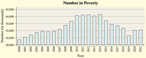
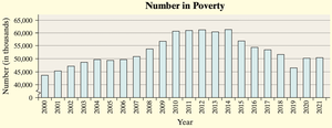
Vertical Scale Manipulation: The following bar graph shows the number of U.S. residents in poverty, but the vertical axis does not start at zero, exaggerating the apparent decrease.
Improved Graph: The next graph includes a break symbol to indicate the truncated scale.
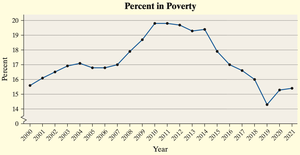
Best Practice: A time-series plot of the percent in poverty focuses on trends rather than misleading differences in area.
Pictogram Misuse: The following image shows a basketball and soccer ball representing participation in sports. The basketball's area is four times that of the soccer ball, exaggerating the difference in participation.

Guidelines for Constructing Good Graphics
Title and label axes clearly, including units and data sources.
Avoid distortion and minimize white space.
Indicate truncated scales clearly.
Avoid clutter and unnecessary backgrounds.
Do not use three-dimensional effects or pictograms that distort the data.
Let the data speak for themselves; avoid drawing attention to specific areas with design tricks.
