 Back
BackStatistics Exam and Worksheet Study Guidance
Study Guide - Smart Notes
 Tailored notes based on your materials, expanded with key definitions, examples, and context.
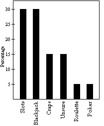
Q4. Construct a Pareto chart to depict the gaming practices of the group of casino goers as percentages.
Background
Topic: Data Visualization – Pareto Charts
This question tests your ability to interpret categorical data and represent it visually using a Pareto chart. Pareto charts are bar graphs where categories are displayed in descending order of frequency or percentage, helping to identify the most significant factors in a dataset.
Key Terms and Concepts:
Pareto Chart: A bar graph that displays categories in order from highest to lowest frequency or percentage.
Percentage: The proportion of each category relative to the total, multiplied by 100.
Categories: Slots, Blackjack, Craps, Roulette, Poker, Unsure.
Step-by-Step Guidance
List the number of patrons for each game: Slots (60), Blackjack (60), Craps (30), Roulette (10), Poker (10), Unsure (remaining out of 200).
Calculate the percentage for each category by dividing the number in each category by the total number of patrons (200), then multiplying by 100.
Order the categories from highest to lowest percentage. This is essential for a Pareto chart.
Match the correct Pareto chart from the provided images by checking which one displays the categories in descending order of percentage.
Try solving on your own before revealing the answer!
Final Answer: B) [image_2]
The correct Pareto chart is the one that displays the categories in descending order of percentage: Slots, Blackjack, Craps, Unsure, Roulette, Poker.
This matches the data and the definition of a Pareto chart.
