 Back
BackStatistics Study Guide: Key Concepts and Practice Problems
Study Guide - Smart Notes
 Tailored notes based on your materials, expanded with key definitions, examples, and context.
Q2. Commute Times for Two Groups of Employees
Background
Topic: Descriptive Statistics & Graphical Summaries
This question tests your ability to describe distributions, choose appropriate measures of center and spread, and select suitable graphical representations for quantitative data.
Key Terms and Formulas:
Shape: Describes the distribution (e.g., symmetric, skewed left/right, unimodal, bimodal).
Mean: Average value, sensitive to skewness and outliers.
Median: Middle value, robust to skewness and outliers.
Standard Deviation: Measures spread; appropriate for symmetric distributions.
Pie Chart: Used for categorical data, not quantitative.
Histogram: Used for quantitative data to show shape, center, and spread.
Step-by-Step Guidance
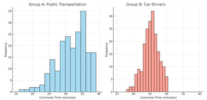
Examine the histograms for both groups. Identify the shape of each distribution: Is it symmetric, skewed left, or skewed right? Is it unimodal or multimodal?
For Group A (Public Transportation), consider whether the mean or median is a better measure of center based on the shape. Think about how skewness affects the mean and median.
For Group B (Car Drivers), evaluate if the standard deviation is a reasonable measure of spread. Recall that standard deviation is most appropriate for symmetric distributions without outliers.
Compare the spread of the two distributions. Which group appears to have a larger standard deviation? Look at the range and variability in the histograms.
Consider whether a pie chart would be appropriate for these data. Remember that pie charts are for categorical data, not quantitative data like commute times.
Think about other suitable graphs for these data, such as dot plots, box plots, or stem-and-leaf plots. Reflect on why these might be better than a pie chart.
Try solving on your own before revealing the answer!
Final Answer:
a) Group A is skewed left and unimodal; Group B is approximately symmetric and unimodal. b) Median is more appropriate for Group A due to skewness. c) Standard deviation is reasonable for Group B because the distribution is symmetric. d) Group A has a larger standard deviation. e) Pie chart is not appropriate for quantitative data. f) Suitable graphs: histogram, box plot, dot plot, stem-and-leaf plot. g) The professor would prefer histograms or box plots for quantitative data, not pie charts.
Q4. Regression Analysis: MPG versus Weight
Background
Topic: Linear Regression & Correlation
This question tests your ability to interpret scatterplots, regression equations, slope and intercept, and correlation coefficients. It also asks you to use the regression equation for prediction.
Key Terms and Formulas:
Scatterplot: Visualizes the relationship between two quantitative variables.
Regression Equation:
Slope (): Change in for each unit increase in .
Intercept (): Predicted value of when .
Correlation Coefficient (): Measures strength and direction of linear association.
Coefficient of Determination (): Proportion of variance in explained by .
Step-by-Step Guidance
Describe the scatterplot: Look for form (linear/nonlinear), direction (positive/negative), and strength (strong/weak).
Identify the explanatory (independent) and response (dependent) variables. Which variable is used to predict the other?
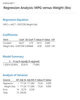
State the regression equation as given in the printout. Make sure to use the correct coefficients.
Interpret the slope: What does the value of mean in context? How does weight affect MPG?
Interpret the intercept: What does the value of mean in context? Is it meaningful for this data?
Set up the calculation to predict MPG for a car weighing 3,250 pounds using the regression equation.
Find the correlation coefficient and interpret its value. What does it tell you about the relationship?
Interpret the coefficient of determination () in context. What proportion of variation in MPG is explained by weight?
Try solving on your own before revealing the answer!
Final Answer:
a) The scatterplot shows a strong negative linear association. b) Explanatory variable: Weight; Response variable: MPG. c) Regression equation: MPG = 44.27 - 0.007258 Weight. d) Slope: For each additional pound, MPG decreases by 0.007258. e) Intercept: Predicted MPG when weight is 0 (not meaningful in context). f) Predicted MPG for 3,250 lbs: Plug into equation. g) Correlation coefficient: (strong negative correlation). h) ; about 84% of variation in MPG is explained by weight.
Q13. Hormone Therapy Experiment: Cancer Rates
Background
Topic: Two-Proportion Z-Test & Hypothesis Testing
This question tests your ability to compare proportions from two independent groups, check assumptions, state hypotheses, and interpret results in context.
Key Terms and Formulas:
Null Hypothesis (): No difference in proportions.
Alternative Hypothesis (): There is a difference in proportions.
Two-Proportion Z-Test:
P-value: Probability of observing the data if is true.
Assumptions: Random samples, independence, sample sizes large enough (successes and failures each ≥ 5).
Step-by-Step Guidance
State the null and alternative hypotheses: , .
Check assumptions: Are the samples random and independent? Are the number of successes and failures in each group ≥ 5?
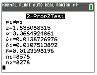
Calculate the sample proportions for each group: , .
Find the pooled proportion: .
Set up the z-test statistic formula using the values above.
Use the calculator output to find the z-value and p-value.
Compare the p-value to the significance level () and decide whether to reject .
Try solving on your own before revealing the answer!
Final Answer:
Assumptions are met. , . Sample proportions: , . Pooled proportion: . z-value , p-value . Since p-value > 0.05, do not reject . Conclusion: No significant difference in cancer rates at the 5% level.
