 Back
BackStep-by-Step Guidance for Statistics Midterm Practice Problems
Study Guide - Smart Notes
 Tailored notes based on your materials, expanded with key definitions, examples, and context.
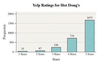
Q23. The graph shows Yelp ratings for Hot Doug’s Restaurant. What was the most popular rating? How many ratings were posted? What percentage of ratings were 5-star ratings? What is the shape of this distribution?
Background
Topic: Descriptive Statistics & Data Visualization
This question tests your ability to interpret bar graphs, calculate percentages, and describe the shape of a distribution.
Key Terms and Formulas:
Frequency: The number of times a particular rating was given.
Percentage:
Distribution Shape: Describes how data is spread (e.g., skewed left, skewed right, symmetric).
Step-by-Step Guidance
Examine the bar graph and identify the frequency for each star rating. Note which bar is the tallest to determine the most popular rating.
Add up the frequencies for all star ratings to find the total number of ratings posted.
Calculate the percentage of 5-star ratings using the formula:
Observe the distribution of the bars. If most ratings are at the higher end (e.g., 5 stars), and fewer at the lower end, describe the shape (e.g., skewed left).
Try solving on your own before revealing the answer!
Final Answer:
The most popular rating is 5 stars. There were 2,747 ratings posted. The percentage of 5-star ratings is approximately 61% (). The shape of the distribution is skewed left, as most ratings are at the higher end.
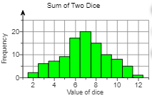
Q24. An experiment was conducted in which two 6-sided dice were thrown 100 times. The sum of the pips was recorded and is shown in the graph below. What was the most frequent outcome? What was the least frequent outcome? Determine the percentage of times a 5 was observed. What is the shape of the distribution?
Background
Topic: Probability Distributions & Data Visualization
This question tests your ability to interpret histograms, identify modes, calculate percentages, and describe distribution shapes.
Key Terms and Formulas:
Mode: The value that appears most frequently in a data set.
Percentage:
Distribution Shape: Bell-shaped distributions are common for sums of dice due to the central limit theorem.
Step-by-Step Guidance
Look at the histogram and identify which sum has the highest bar (most frequent outcome).
Identify which sum has the lowest bar (least frequent outcome).
Find the frequency for the sum of 5 and calculate its percentage out of 100 trials using the formula above.
Describe the shape of the distribution based on the histogram. Is it symmetric, bell-shaped, or skewed?
Try solving on your own before revealing the answer!
Final Answer:
The most frequent outcome is 7. The least frequent outcome is 12. The percentage of times a 5 was observed is approximately 9%. The shape of the distribution is bell-shaped.
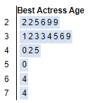
Q26. The stem plot below shows the ages of best actress winners from 2003 to 2022. What is the age of the oldest and youngest winners?
Background
Topic: Data Visualization (Stem-and-Leaf Plot)
This question tests your ability to read a stem-and-leaf plot and identify minimum and maximum values.
Key Terms and Formulas:
Stem-and-Leaf Plot: A graphical method to display quantitative data where each "leaf" represents a data point.
Minimum/Maximum: The smallest and largest values in the data set.
Step-by-Step Guidance
Read the stem-and-leaf plot. The "stem" represents the tens digit, and the "leaf" represents the units digit.
Identify the smallest leaf in the lowest stem for the youngest winner.
Identify the largest leaf in the highest stem for the oldest winner.
Try solving on your own before revealing the answer!
Final Answer:
The age of the youngest winner is 22, and the oldest winner is 74.
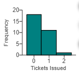
Q29. Thirty students were randomly selected and asked how many speeding tickets they’ve gotten in the last month. The results are shown in the histogram below. Describe the shape of the histogram. Based on this shape, would you expect the mean to be greater than, equal to, or less than the median? Find the mean, median, and mode.
Background
Topic: Descriptive Statistics & Data Visualization
This question tests your ability to interpret histograms, describe distribution shapes, and relate shape to measures of center.
Key Terms and Formulas:
Histogram: A graphical representation of the distribution of numerical data.
Skewed Right: A distribution with a tail on the right side; mean is typically greater than median.
Mean, Median, Mode: Measures of center for a data set.
Step-by-Step Guidance
Examine the histogram and describe its shape (e.g., skewed right, symmetric).
Recall that in a right-skewed distribution, the mean is usually greater than the median.
To find the mean, add up all the values and divide by the number of students.
To find the median, order the values and find the middle value.
To find the mode, identify the value that appears most frequently.
Try solving on your own before revealing the answer!
Final Answer:
The shape of the histogram is skewed right. The mean is greater than the median. The mean is 0.43, the median is 0, and the mode is 0.
