 Back
BackChapter 2 STAT
Study Guide - Smart Notes
 Tailored notes based on your materials, expanded with key definitions, examples, and context.
Chapter 2: Summarizing Data in Tables and Graphs
Section 2.1: Organizing Qualitative Data
Qualitative data, also known as categorical data, must be organized to facilitate analysis and interpretation. This section covers methods for organizing, displaying, and comparing qualitative data using tables and graphical representations.
Organizing Qualitative Data in Tables
Frequency Distribution: A table listing each category of data and the number of occurrences (frequency) for each category.
Relative Frequency: The proportion (or percent) of observations within a category, calculated as:
Relative Frequency Distribution: A table listing each category with its relative frequency.
Example: Survey responses for "Best Day of the Week" can be organized into frequency and relative frequency tables to summarize the data.
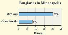
Constructing Bar Graphs
Bar Graph: Categories are labeled on one axis, and frequencies or relative frequencies on the other. Rectangles of equal width represent each category, with height proportional to frequency or relative frequency.
Pareto Chart: A bar graph with bars ordered in decreasing frequency or relative frequency.
Side-by-Side Bar Graphs: Used to compare two groups (e.g., native- and foreign-born citizens) using relative frequencies for fair comparison.
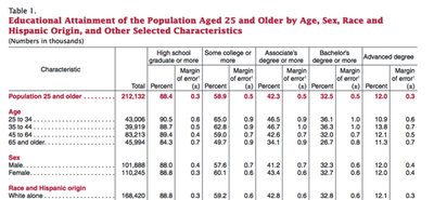
Example: Educational attainment by gender can be compared using side-by-side bar graphs.
Constructing Pie Charts
Pie Chart: A circle divided into sectors, each representing a category. The area of each sector is proportional to the category's frequency.
Example: Pie charts can display the distribution of survey responses or product manufacturers.
Graph Comparisons
Choosing Graph Types: Bar graphs are preferred for comparing categories, especially when there are many categories or when exact values are important. Pie charts are best for showing parts of a whole but are less effective with many categories or small differences.
Limitations: Pie charts cannot be drawn if categories are not mutually exclusive or if data are not proportions of a whole; bar graphs can still be used in these cases.
Section 2.2: Organizing Quantitative Data
Quantitative data can be discrete (countable values) or continuous (measurable values). The organization and graphical representation depend on the type of data.
Organizing Discrete Data in Tables
Frequency and Relative Frequency Distributions: Tables summarizing how often each value occurs and its proportion in the dataset.
Example: Number of siblings among students can be summarized in such tables.
Constructing Histograms of Discrete Data
Histogram: Rectangles represent classes (values or intervals), with height showing frequency or relative frequency. Bars touch each other, indicating continuous or sequential data.
Example: Histogram of number of televisions owned by survey participants.
Organizing Continuous Data in Tables
Classes: Intervals into which data are grouped. Each class has a lower and upper class limit, and class width is the difference between consecutive lower class limits.
Open-Ended Classes: The last class may not have an upper limit if data are unbounded.
Example: Unemployment rates by state can be grouped into intervals for analysis.
Constructing Histograms of Continuous Data
Histogram: Used for continuous data, with class intervals on the axis and bars representing frequency or relative frequency.
Adjusting Class Width: Changing the starting point or width of bins affects the appearance and interpretation of the histogram.
Drawing Dot Plots
Dot Plot: Each observation is represented by a dot above its value on a number line. Useful for small datasets to visualize distribution and clusters.
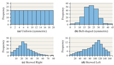
Identifying the Shape of a Distribution
Uniform Distribution: Frequencies are evenly spread across values.
Bell-Shaped (Symmetric): Highest frequency in the middle, tapering off symmetrically.
Skewed Right: Tail on the right is longer; most data are on the left.
Skewed Left: Tail on the left is longer; most data are on the right.
Note: These terms are not used for qualitative data.
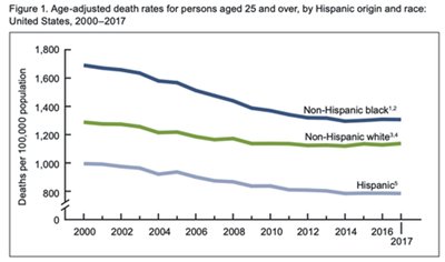
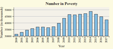
Drawing Time-Series Graphs
Time-Series Plot: Plots time on the horizontal axis and the variable of interest on the vertical axis, connecting points with line segments. Useful for identifying trends over time.
Example: Age-adjusted death rates by ethnicity over time can be visualized with a time-series plot.
Section 2.3: Graphical Misrepresentations of Data
Graphs are powerful tools for data presentation but can be misleading if not constructed properly. This section discusses common pitfalls and how to avoid them.
What Can Make a Graph Misleading or Deceptive?
Scale Issues: Inconsistent or manipulated scales can exaggerate or minimize differences.
Misplaced Origin: Starting the axis at a value other than zero can distort perceptions of magnitude.
Inconsistent Increments: Tick marks should be evenly spaced; otherwise, the graph can mislead.
Comparative Graphs: Scales should be the same for fair comparison between groups.
Example: Bar graphs with truncated axes or pictorial representations that exaggerate differences can mislead viewers.
Summary Table: Types of Graphs and Their Uses
Graph Type | Best Use | Limitations |
|---|---|---|
Bar Graph | Comparing categories (qualitative or discrete data) | Can be misleading if scales are inconsistent |
Pareto Chart | Highlighting most frequent categories | Only for qualitative data |
Pie Chart | Showing parts of a whole | Ineffective with many categories or small differences |
Histogram | Visualizing distribution of quantitative data | Choice of bin width affects interpretation |
Dot Plot | Small datasets, showing clusters and gaps | Not suitable for large datasets |
Time-Series Plot | Trends over time | Not for categorical data |
