True or False: The shape of the distribution shown is best classified as skewed left.
Table of contents
- 1. Intro to Stats and Collecting Data1h 14m
- 2. Describing Data with Tables and Graphs1h 56m
- 3. Describing Data Numerically2h 5m
- 4. Probability2h 17m
- 5. Binomial Distribution & Discrete Random Variables3h 6m
- 6. Normal Distribution and Continuous Random Variables2h 11m
- 7. Sampling Distributions & Confidence Intervals: Mean3h 23m
- Sampling Distribution of the Sample Mean and Central Limit Theorem19m
- Distribution of Sample Mean - ExcelBonus23m
- Introduction to Confidence Intervals15m
- Confidence Intervals for Population Mean1h 18m
- Determining the Minimum Sample Size Required12m
- Finding Probabilities and T Critical Values - ExcelBonus28m
- Confidence Intervals for Population Means - ExcelBonus25m
- 8. Sampling Distributions & Confidence Intervals: Proportion2h 10m
- 9. Hypothesis Testing for One Sample5h 8m
- Steps in Hypothesis Testing1h 6m
- Performing Hypothesis Tests: Means1h 4m
- Hypothesis Testing: Means - ExcelBonus42m
- Performing Hypothesis Tests: Proportions37m
- Hypothesis Testing: Proportions - ExcelBonus27m
- Performing Hypothesis Tests: Variance12m
- Critical Values and Rejection Regions28m
- Link Between Confidence Intervals and Hypothesis Testing12m
- Type I & Type II Errors16m
- 10. Hypothesis Testing for Two Samples5h 37m
- Two Proportions1h 13m
- Two Proportions Hypothesis Test - ExcelBonus28m
- Two Means - Unknown, Unequal Variance1h 3m
- Two Means - Unknown Variances Hypothesis Test - ExcelBonus12m
- Two Means - Unknown, Equal Variance15m
- Two Means - Unknown, Equal Variances Hypothesis Test - ExcelBonus9m
- Two Means - Known Variance12m
- Two Means - Sigma Known Hypothesis Test - ExcelBonus21m
- Two Means - Matched Pairs (Dependent Samples)42m
- Matched Pairs Hypothesis Test - ExcelBonus12m
- Two Variances and F Distribution29m
- Two Variances - Graphing CalculatorBonus16m
- 11. Correlation1h 24m
- 12. Regression3h 33m
- Linear Regression & Least Squares Method26m
- Residuals12m
- Coefficient of Determination12m
- Regression Line Equation and Coefficient of Determination - ExcelBonus8m
- Finding Residuals and Creating Residual Plots - ExcelBonus11m
- Inferences for Slope31m
- Enabling Data Analysis ToolpakBonus1m
- Regression Readout of the Data Analysis Toolpak - ExcelBonus21m
- Prediction Intervals13m
- Prediction Intervals - ExcelBonus19m
- Multiple Regression - ExcelBonus29m
- Quadratic Regression15m
- Quadratic Regression - ExcelBonus10m
- 13. Chi-Square Tests & Goodness of Fit2h 21m
- 14. ANOVA2h 29m
2. Describing Data with Tables and Graphs
Histograms
Problem 2.2.9f
Textbook Question
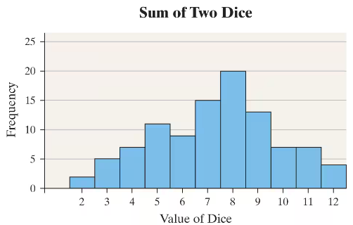
Rolling the Dice An experiment was conducted in which two fair dice were thrown 100 times. The sum of the pips showing on the dice was then recorded. The following frequency histogram gives the results.
f. Describe the shape of the distribution.

Verified step by step guidance1
Observe the histogram which shows the frequency of sums obtained from rolling two dice 100 times. The x-axis represents the possible sums (from 2 to 12), and the y-axis represents the frequency of each sum.
Notice that the frequencies increase from the lower sums, reach a peak around the middle sums (specifically at 7 or 8), and then decrease symmetrically towards the higher sums.
This pattern suggests that the distribution is roughly symmetric, with the highest frequency near the center of the range of possible sums.
The shape resembles a bell-shaped curve, which is typical for the sum of two dice because there are more combinations that result in middle sums (like 7) than extreme sums (like 2 or 12).
Therefore, describe the shape of the distribution as approximately symmetric and unimodal, with a peak around the sum of 7 or 8.
Verified video answer for a similar problem:This video solution was recommended by our tutors as helpful for the problem above
Video duration:
1mPlay a video:
0 Comments
Key Concepts
Here are the essential concepts you must grasp in order to answer the question correctly.
Shape of a Distribution
The shape of a distribution describes the overall pattern of data values when plotted, such as symmetric, skewed, uniform, or bimodal. It helps in understanding the nature of the data and identifying any patterns or anomalies. For example, a symmetric distribution has roughly equal frequencies on both sides of the center.
Recommended video:
Uniform Distribution
Frequency Histogram
A frequency histogram is a graphical representation showing the number of observations (frequency) for different intervals or categories. It helps visualize the distribution of data, making it easier to identify the shape, center, and spread. In this case, it shows how often each sum of two dice occurred.
Recommended video:
Guided course
Intro to Histograms
Probability Distribution of Dice Sums
When rolling two fair dice, the sums range from 2 to 12, with some sums more likely than others due to the number of combinations producing them. For example, 7 is the most common sum because it can be made in six ways, leading to a peak in the distribution. Understanding this helps explain the histogram's shape.
Recommended video:
Guided course
Finding Multiple Probabilities in Binomial Distribution
Related Videos
Related Practice
Textbook Question
49
views
