True or False: The shape of the distribution shown is best classified as skewed left.
Table of contents
- 1. Intro to Stats and Collecting Data1h 14m
- 2. Describing Data with Tables and Graphs1h 56m
- 3. Describing Data Numerically2h 5m
- 4. Probability2h 17m
- 5. Binomial Distribution & Discrete Random Variables3h 6m
- 6. Normal Distribution and Continuous Random Variables2h 11m
- 7. Sampling Distributions & Confidence Intervals: Mean3h 23m
- Sampling Distribution of the Sample Mean and Central Limit Theorem19m
- Distribution of Sample Mean - ExcelBonus23m
- Introduction to Confidence Intervals15m
- Confidence Intervals for Population Mean1h 18m
- Determining the Minimum Sample Size Required12m
- Finding Probabilities and T Critical Values - ExcelBonus28m
- Confidence Intervals for Population Means - ExcelBonus25m
- 8. Sampling Distributions & Confidence Intervals: Proportion2h 10m
- 9. Hypothesis Testing for One Sample5h 8m
- Steps in Hypothesis Testing1h 6m
- Performing Hypothesis Tests: Means1h 4m
- Hypothesis Testing: Means - ExcelBonus42m
- Performing Hypothesis Tests: Proportions37m
- Hypothesis Testing: Proportions - ExcelBonus27m
- Performing Hypothesis Tests: Variance12m
- Critical Values and Rejection Regions28m
- Link Between Confidence Intervals and Hypothesis Testing12m
- Type I & Type II Errors16m
- 10. Hypothesis Testing for Two Samples5h 37m
- Two Proportions1h 13m
- Two Proportions Hypothesis Test - ExcelBonus28m
- Two Means - Unknown, Unequal Variance1h 3m
- Two Means - Unknown Variances Hypothesis Test - ExcelBonus12m
- Two Means - Unknown, Equal Variance15m
- Two Means - Unknown, Equal Variances Hypothesis Test - ExcelBonus9m
- Two Means - Known Variance12m
- Two Means - Sigma Known Hypothesis Test - ExcelBonus21m
- Two Means - Matched Pairs (Dependent Samples)42m
- Matched Pairs Hypothesis Test - ExcelBonus12m
- Two Variances and F Distribution29m
- Two Variances - Graphing CalculatorBonus16m
- 11. Correlation1h 24m
- 12. Regression3h 33m
- Linear Regression & Least Squares Method26m
- Residuals12m
- Coefficient of Determination12m
- Regression Line Equation and Coefficient of Determination - ExcelBonus8m
- Finding Residuals and Creating Residual Plots - ExcelBonus11m
- Inferences for Slope31m
- Enabling Data Analysis ToolpakBonus1m
- Regression Readout of the Data Analysis Toolpak - ExcelBonus21m
- Prediction Intervals13m
- Prediction Intervals - ExcelBonus19m
- Multiple Regression - ExcelBonus29m
- Quadratic Regression15m
- Quadratic Regression - ExcelBonus10m
- 13. Chi-Square Tests & Goodness of Fit2h 21m
- 14. ANOVA2h 29m
2. Describing Data with Tables and Graphs
Histograms
Problem 2.2.9a
Textbook Question
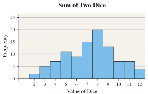
Rolling the Dice An experiment was conducted in which two fair dice were thrown 100 times. The sum of the pips showing on the dice was then recorded. The following frequency histogram gives the results.

a. What was the most frequent outcome of the experiment?
b. What was the least frequent?
Verified step by step guidance1
Step 1: Understand the histogram. The x-axis represents the possible sums when two dice are rolled (from 2 to 12), and the y-axis shows the frequency of each sum occurring in 100 rolls.
Step 2: Identify the most frequent outcome by looking for the tallest bar in the histogram. The height of each bar corresponds to how many times that sum appeared.
Step 3: Identify the least frequent outcome by finding the shortest bar in the histogram, which represents the sum that appeared the fewest times.
Step 4: Note the values on the x-axis corresponding to these tallest and shortest bars to determine the sums for the most and least frequent outcomes.
Step 5: Use these observations to answer the questions: the most frequent outcome is the sum with the highest frequency, and the least frequent outcome is the sum with the lowest frequency.
Verified video answer for a similar problem:This video solution was recommended by our tutors as helpful for the problem above
Video duration:
1mPlay a video:
0 Comments
Key Concepts
Here are the essential concepts you must grasp in order to answer the question correctly.
Frequency Distribution
A frequency distribution shows how often each outcome occurs in a data set. In this experiment, it displays how many times each possible sum of two dice appeared in 100 rolls, helping identify the most and least common sums.
Recommended video:
Guided course
Intro to Frequency Distributions
Sum of Two Dice Outcomes
When rolling two dice, the possible sums range from 2 to 12. Each sum has a different probability based on the number of dice combinations that produce it, with 7 being the most likely sum due to the highest number of combinations.
Recommended video:
Guided course
Probabilities Between Two Values
Interpreting Histograms
A histogram visually represents data frequencies using bars. The height of each bar corresponds to the frequency of each sum, allowing quick identification of the most and least frequent outcomes in the experiment.
Recommended video:
Guided course
Intro to Histograms
Related Videos
Related Practice
Textbook Question
49
views
